Stage transitions and feedback
It's impossible to build a truly candidate-first process without providing candidates with the means to give feedback on their experiences. This week we've launched transitions, which invite candidates to provide feedback on their application thus far they move between stages in your hiring process.
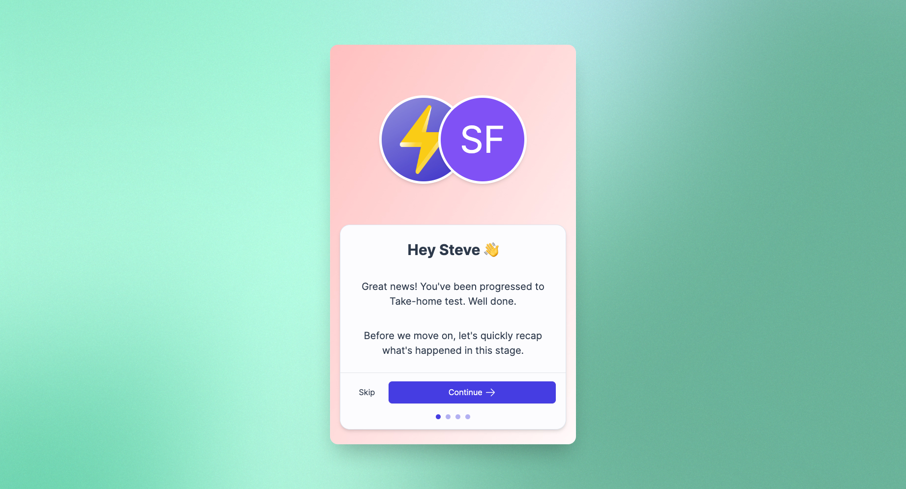
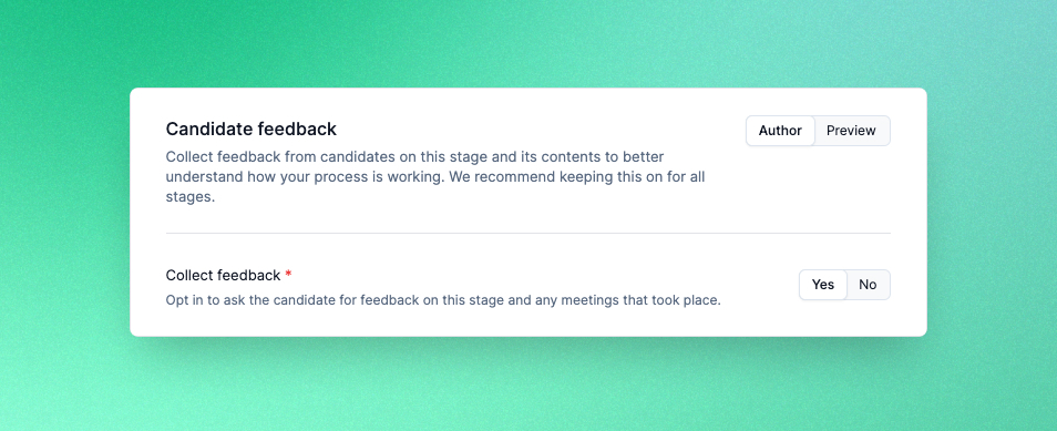
Transitions appear on candidates' dashboards when they are progressed. Candidates are shown a recap of what's happened thus far alongside content that you can personalise. If you have opted to ask for feedback in job authoring, candidates will also be prompted to rate their experience and add any comments they might have on it.
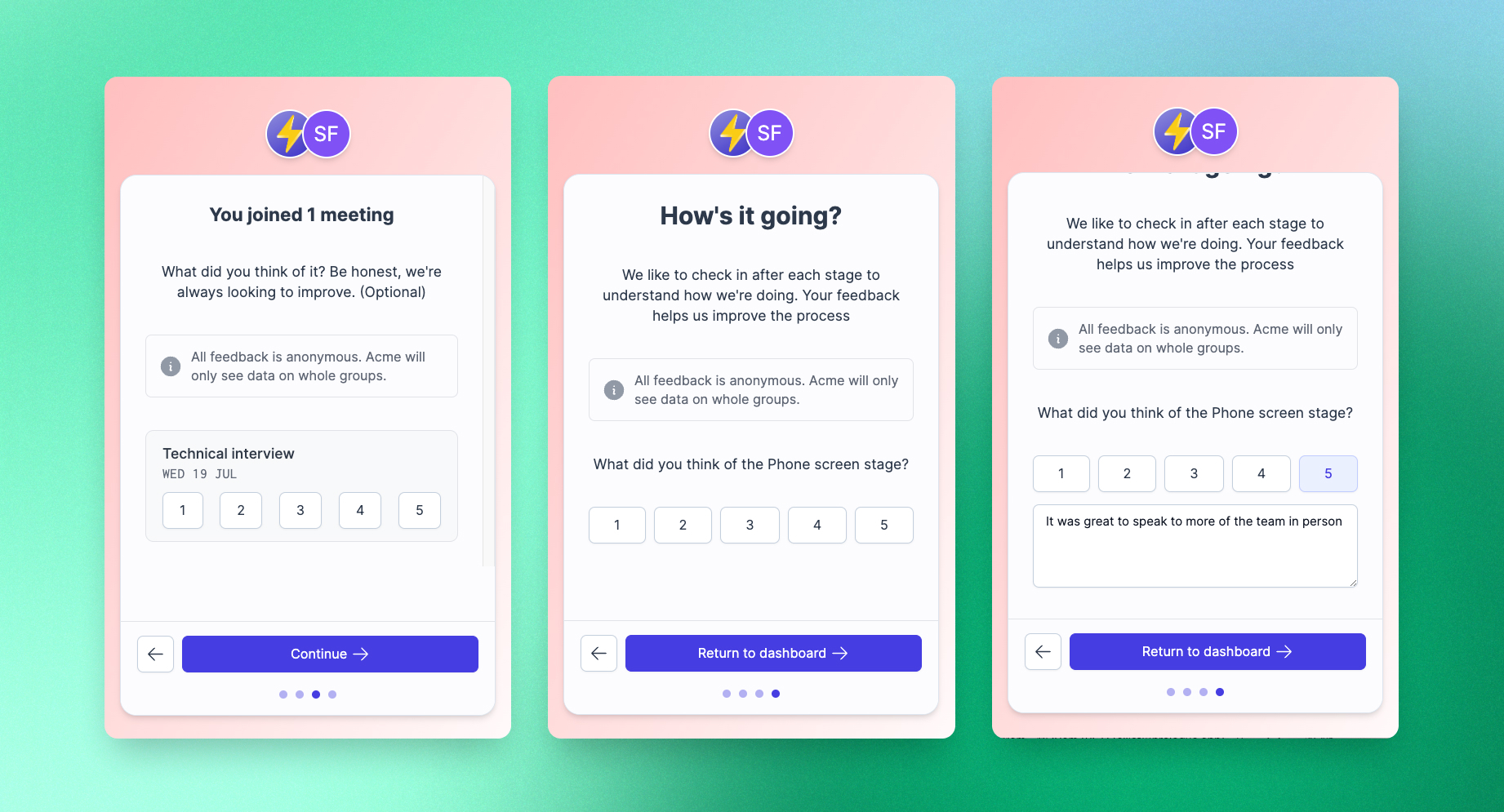
For stages with multiple steps, such as meetings, candidate responses can be linked to individual parts of the stage. In the coming weeks we'll be extending Prologue's reporting and insights capabilities to surface all this information and help you improve your processes even further. Stay tuned!
Relationship management – reminders
Finding amazing candidates is hard. For one thing, it's not uncommon to find the perfect person for a role, only to find out that it's not the right time to speak. Reminders let you quickly arrange to follow up with candidates, whether they're going on holiday for a few weeks or want to check back in 6 months' time.
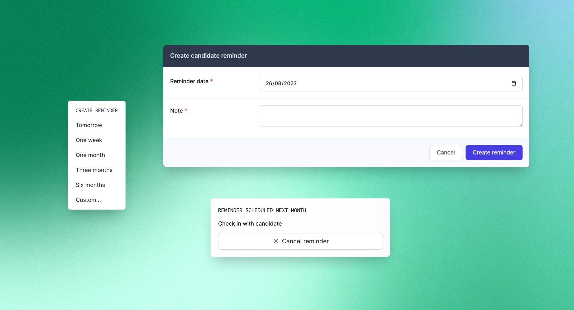
If something changes, cancelling is just as easy!
Improvements and fixes
- When moving combinations of externally sourced and applied candidates, all candidates will now end up in the correct stage (that is, the first non-sourced/non-applied stage you have configured).
Candidate availability
Since we launched the ability to intelligently coordinate multiple meetings at once, we've been working on making Prologue's scheduling capabilities even more powerful. Today we're excited to announce several features that we've shipped in the past week in this vein. First up, you can now specify candidate availability when scheduling meetings:
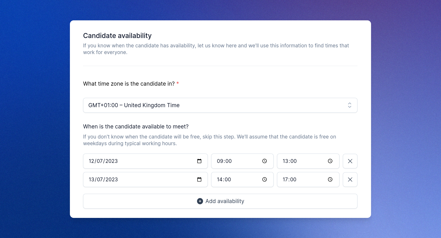
Just as with the availability of your team, Prologue will use this information to find the best possible times for meetings to take place, even across multiple time zones. Moreover, if you know for instance that the candidate won't be available until next week, or that someone in your team will be away for a few days, you can now also specify a date from which Prologue should begin searching for good times:

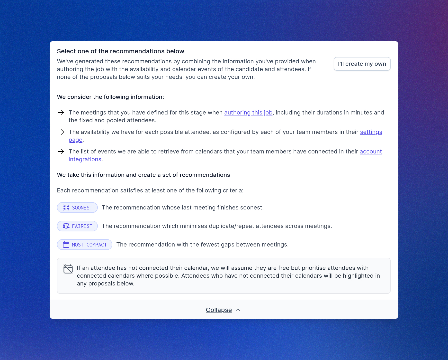
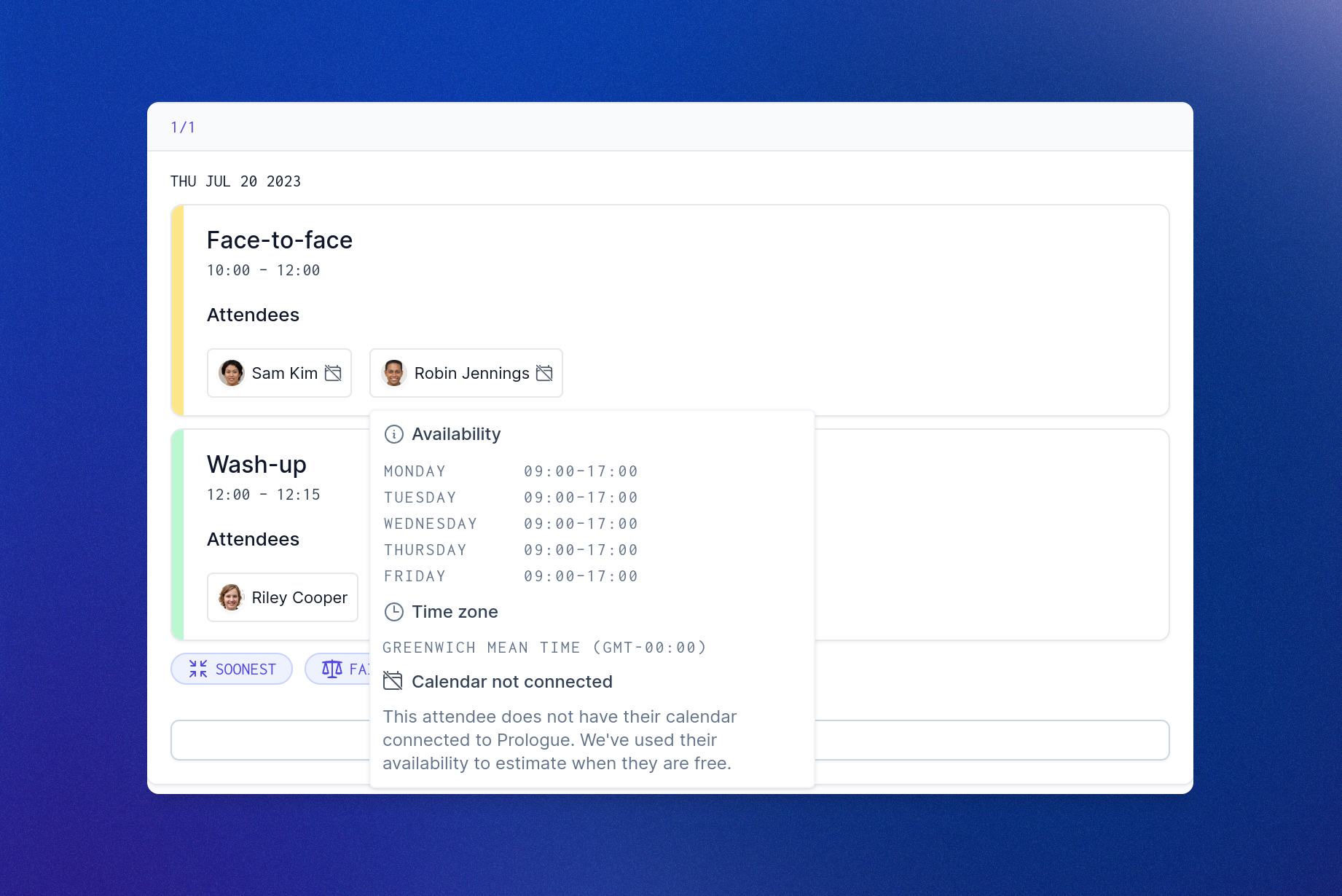
Finally, we've made it clearer how Prologue will use the information you provide to produce recommendations, so that you can make the best choice for all attendees. This includes better clarity around the availability and calendars of your team, as well as other factors Prologue considers when generating possible schedules.
Scheduling multiple meetings
A candidate-first process moves with the candidate and respects their time. Our new multi-meeting scheduling and recommendation features make finding time for candidates to meet with your team easier than ever, leaving you with time to focus on the important parts of the experience.
When configuring a meeting in job authoring, you can now specify the meeting's default duration, as well as the attendees that should be present in the meeting:
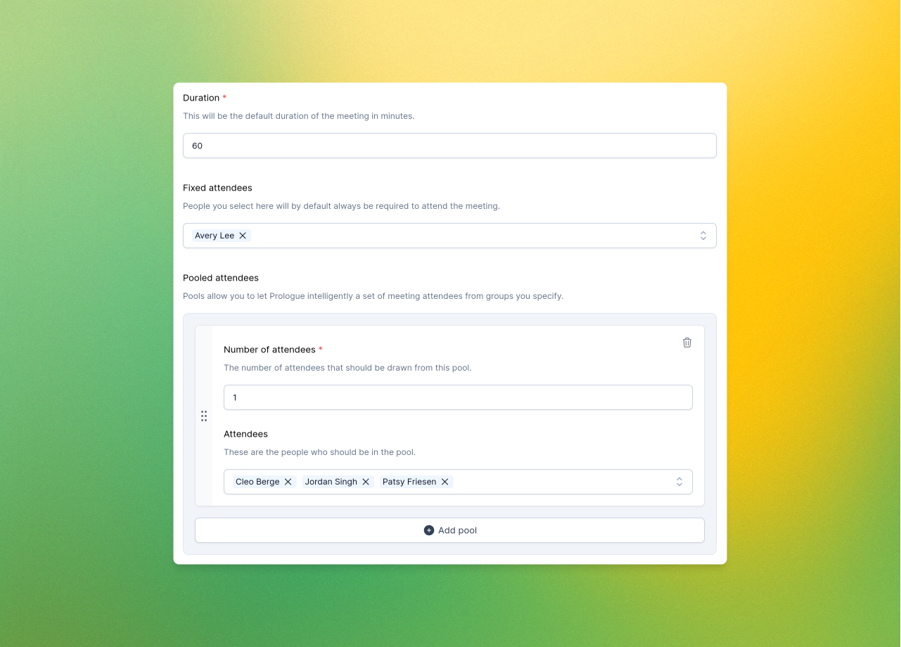
Attendees can either be fixed, meaning that Prologue will always find a way to have them attend, or pooled, meaning that Prologue will try to find the best combination of attendees from groups you specify (more on what “best” means later!).
With authoring complete, Prologue's intelligent task system will now help you schedule multiple meetings in one go, via the new “Schedule all” button:

Clicking the button will open up the supercharged scheduling pane, which will ask you whether you want to schedule the meetings yourself or invite the candidate to schedule them. If you opt to schedule them yourself, Prologue will crunch the numbers and recommend some dates and times:
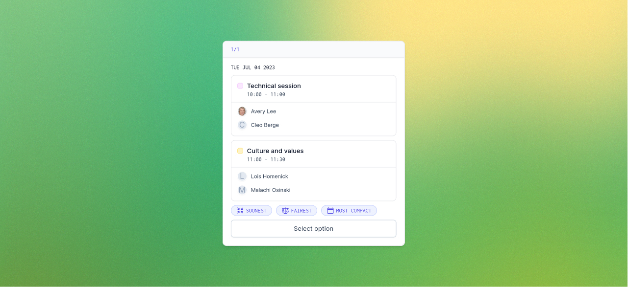
Presently Prologue will tag recommendations as being soonest (the soonest possible schedule for all meetings to finish), fairest (the best distribution of load amongst attendees), and most compact (the least amount of time between meetings). Often we'll be able to find an option that satisfies more than one of these properties. Click the option that suits you best (or opt to create your own) and Prologue will lay out a calendar view where you can get a feel for how the proposal looks:
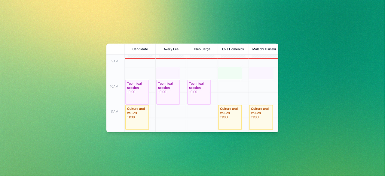
Here you can edit times and attendees if you have specific needs or customisations to make.
Inviting the candidate to schedule the meetings themselves is just as easy. We'll ask you to specify the attendees and show you how their calendars look before you move forward. Either way, when you're happy with the layout, it's time to finesse the invites that will be sent:
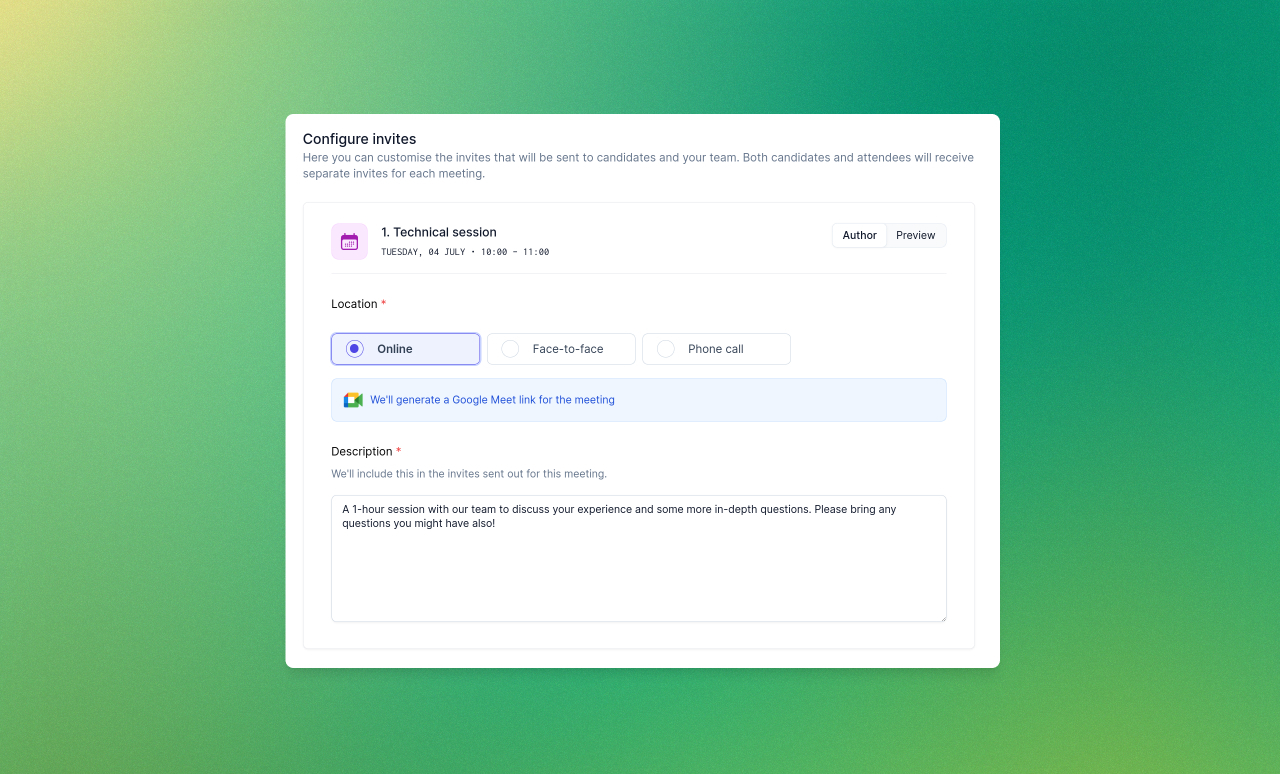
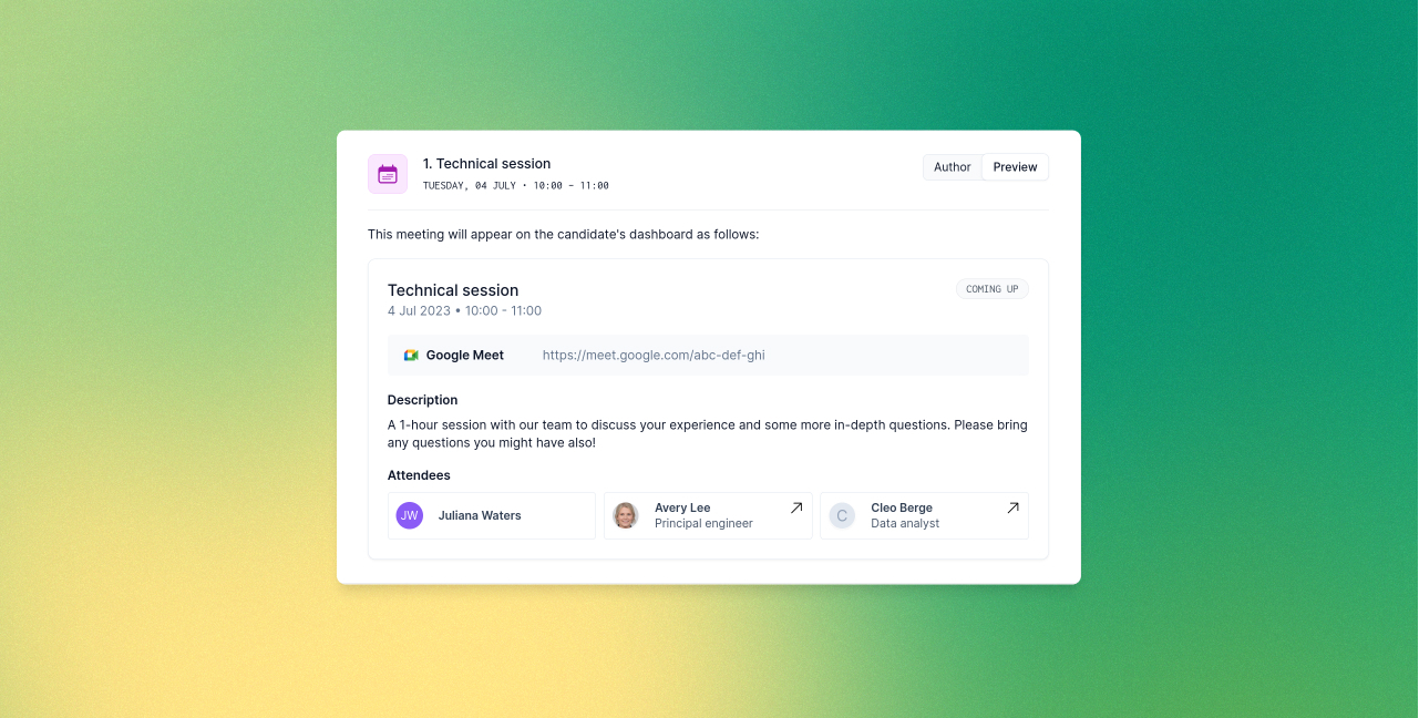
Here you can configure meeting locations or ask Prologue to generate video conferencing links for you. Use the “Preview” tab to see exactly what the candidate will see in their dashboard. When you're happy, click “Send invites” and sit back – we'll take care of the rest!
Magic links
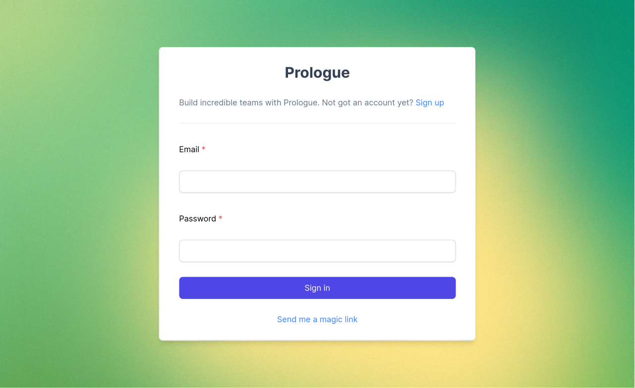
Passwords can be pesky things. Signing in from a new device, or working out what to do when you've forgotten that all-important phrase can be a real pain. Why can't the site just let me in? Well, with magic links, it can! Click the new “Send me a magic link” option on the sign-in page and enter your email address and Prologue will send you a secure one-time link to sign in:
Improvements to the pipeline and Kanban board
This week we've been hard at work improving the visual hierarchy and consistency of Prologue in preparation for a number of exciting changes coming in the following weeks (stay tuned for those!). First up, we've pulled out our new and improved navigation bar so that you can always tell which elements will stay put when you navigate and which will change with the page you're on.
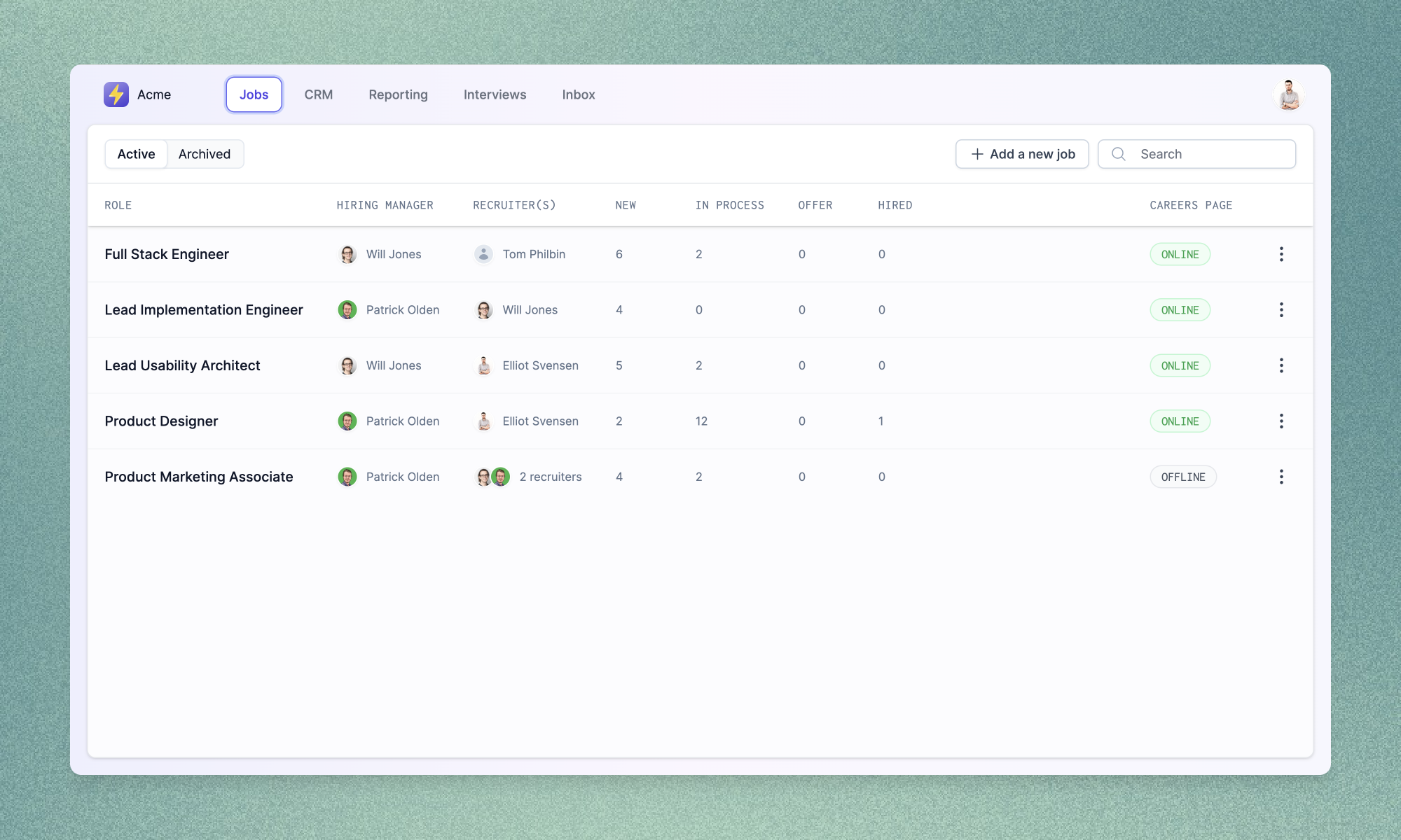
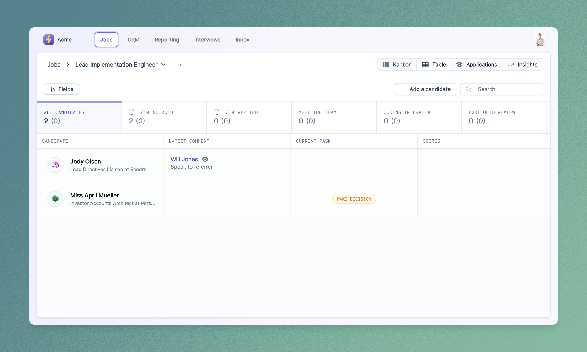
The pipeline and Kanban board views have been given a fresh lick of paint to fit into this new structure. The pipeline view now shows current candidate tasks (bringing it more in line with the existing Kanban tickets), while the Kanban board displays more granular counts (including information about new candidates) and better breakdowns of applications needing review.
Improvements and fixes
- We've added richer editor controls for authoring job descriptions and other fields which use Markdown. You can now emphasise text, add headings or create links using newly added toolbar buttons.
- You can now customise the set and order of team member biographies that will appear on your careers page using the new “Meet the team” section in the “Careers page” settings page.
Job authoring redux
Job authoring is at the heart of the recruitment process, and we're excited to share the next iteration of it in Prologue. Job creation and updates are now split over multiple tabs, making it easier to focus on the task at hand, or to spot errors or missing fields across a job's data set.

Dividing up the process in this way allows us to provide more real estate to important activities, such as previewing job descriptions or configuring application questions. In the near future we'll also be taking advantage of the new layout to surface information relevant to the edits you're currently making – the required reading age and gender codings of your job descriptions, or total length of your interview process, for instance.
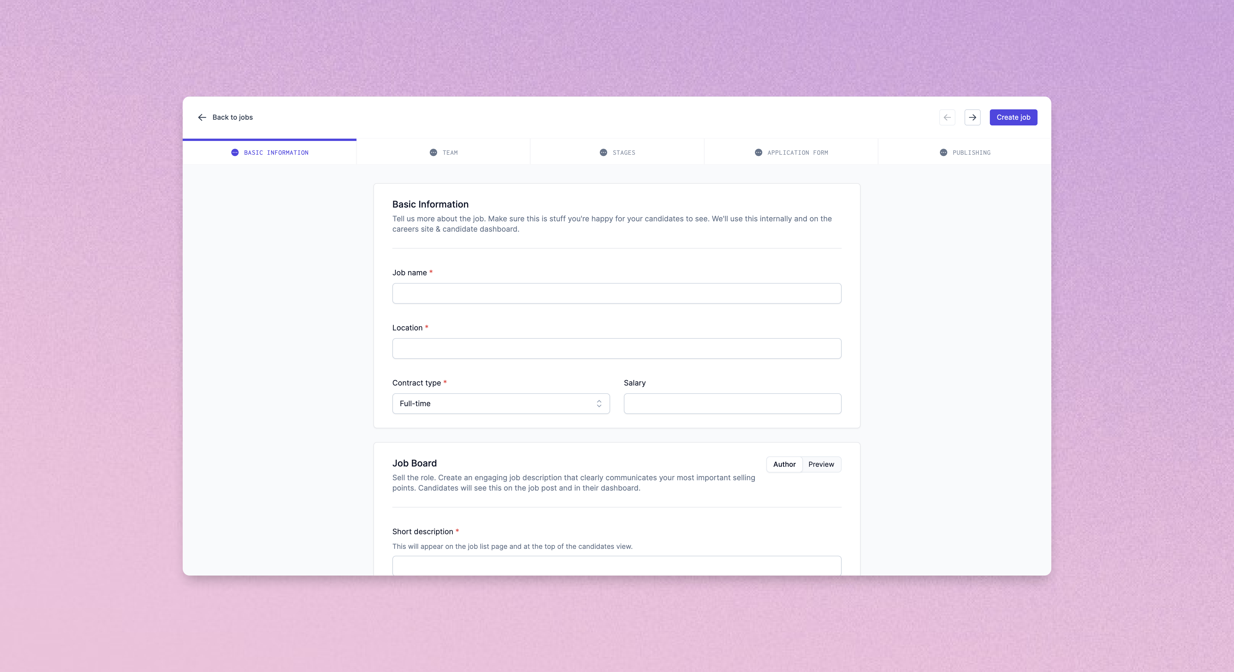
Job stages have also been given a new lease of life, with a slicker interface for adding, removing and reordering stages as well as more break-out space for configuring meetings and candidate messaging.
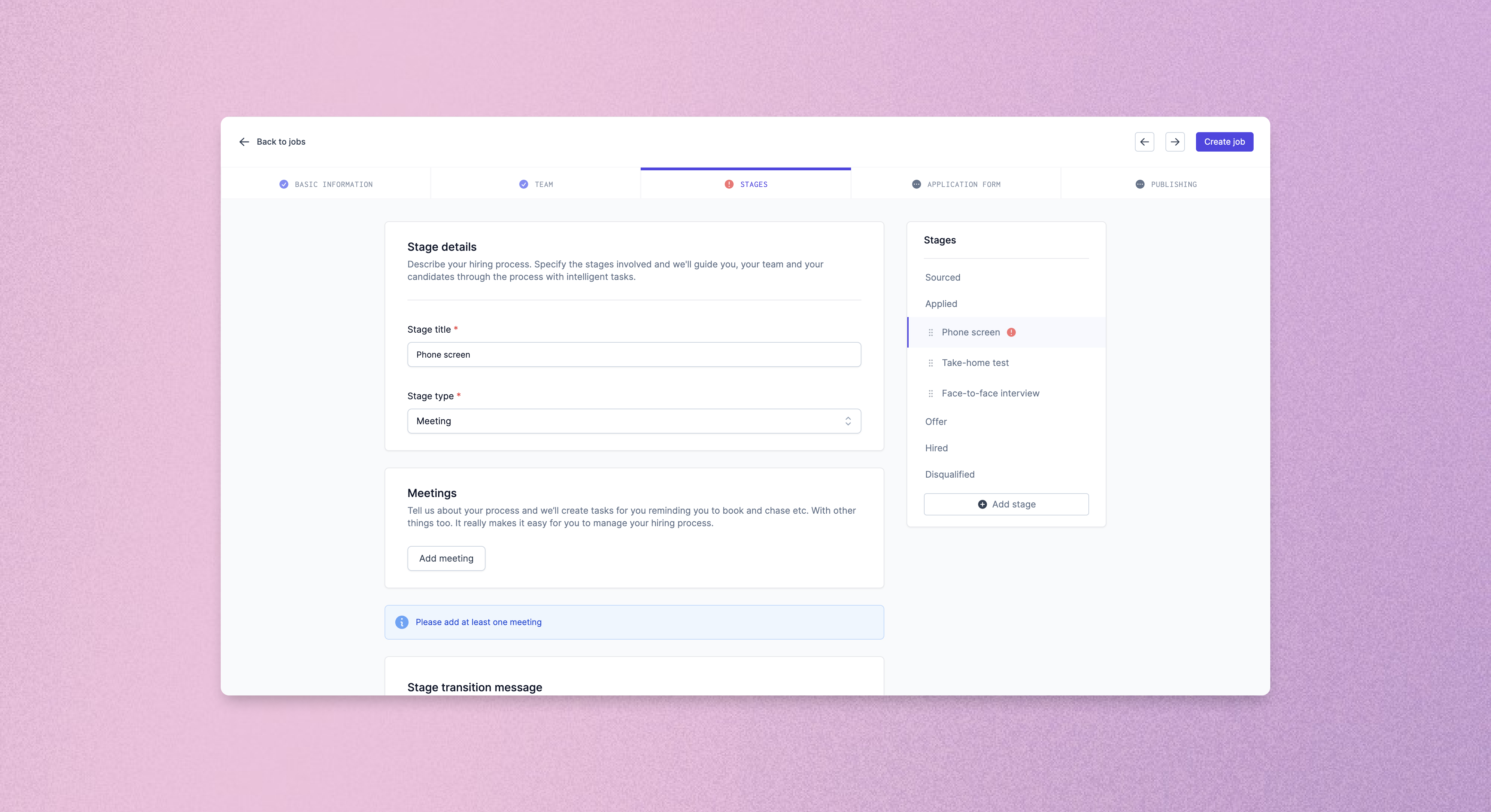
We really hope you enjoy Prologue's new authoring experience. Let us know what you think!
Improved (improved) navigation
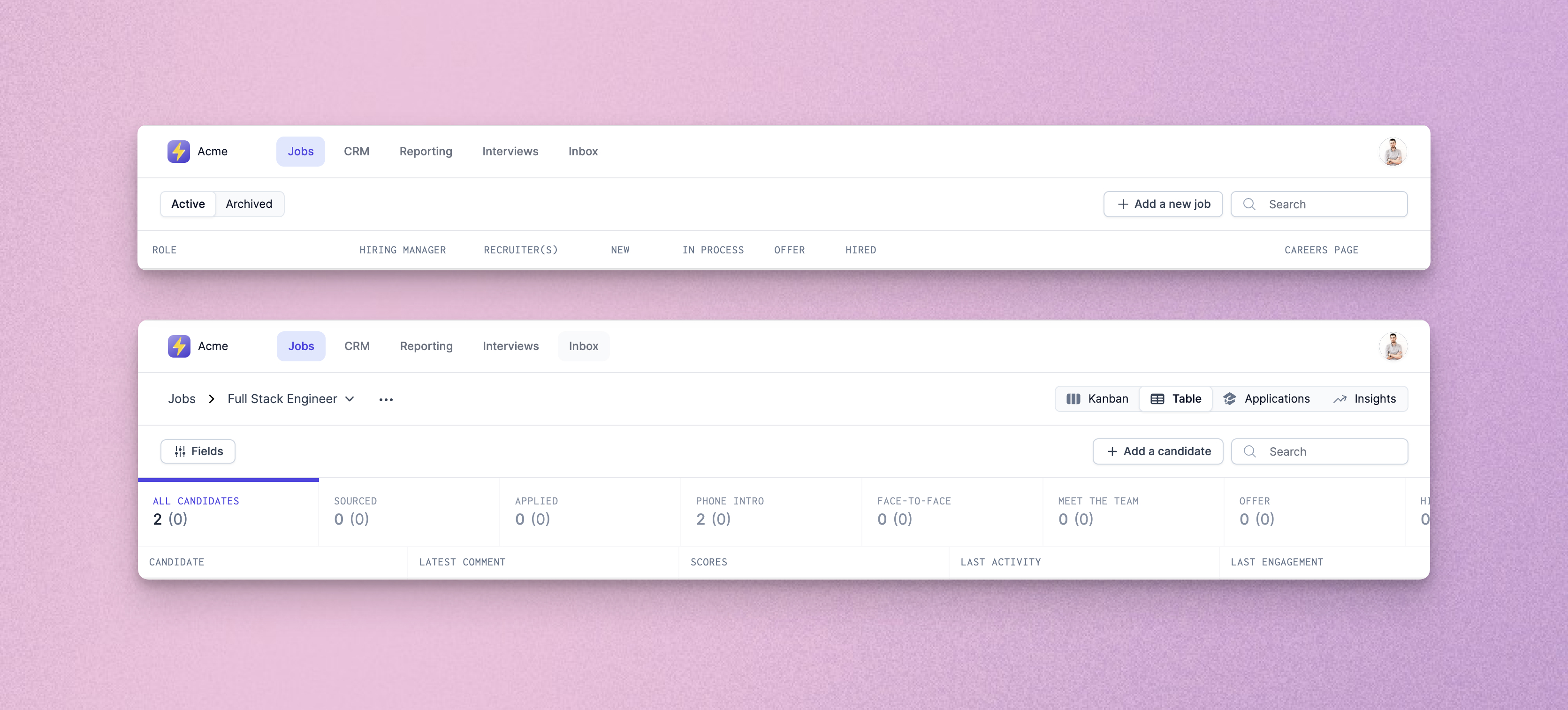
After feedback we received on last week's navigation improvements, we've rejigged the top navigation bar to do away with the sidebar entirely, and give you a single, always accessible place to move around your Prologue instance.
Improvements and fixes
- We've fixed issues with outdated messages flickering in the progression dialog when moving candidates between stages.
- PDF CVs are now embedded into the “Profile” tab of the application review details screen, allowing quicker review of candidate profiles.
- Application review details pages will now automatically move to the next candidate in the list when you make a decision to disqualify or progress.
- Application review checkboxes have been padded out so that they are easier to click. A new “Select all” option is also available for quick selection of all candidates (check out the keyboard shortcuts too – Ctrl/Cmd+A to select all, Escape to clear, and Shift+Click to select groups!).
Application reviews
Reviewing new candidate profiles can be one of the most time-consuming tasks in a recruitment process, especially for sought-after roles that receive large numbers of applications. This week we've launched a brand new bespoke experience to help you streamline application reviews and be candidate-first from the off.
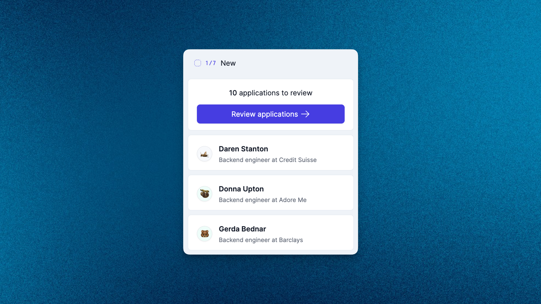
Quickly see how many candidates need your attention from the new decluttered Kanban board, which better separates applications from sourced candidates. Disqualify or progress at a high level based on automatically surfaced profile information and experience, or drill down into specific profiles before making a decision.
Getting back to applicants in a timely fashion is only one component of building a candidate-first process that engages potential hires. Personalised and constructive feedback, whether or not a candidate progresses, is something that all candidates deserve. Prologue gives you the tools to deliver this at scale, whether reviewing candidates individually or in aggregate, using our bulk processing tools:
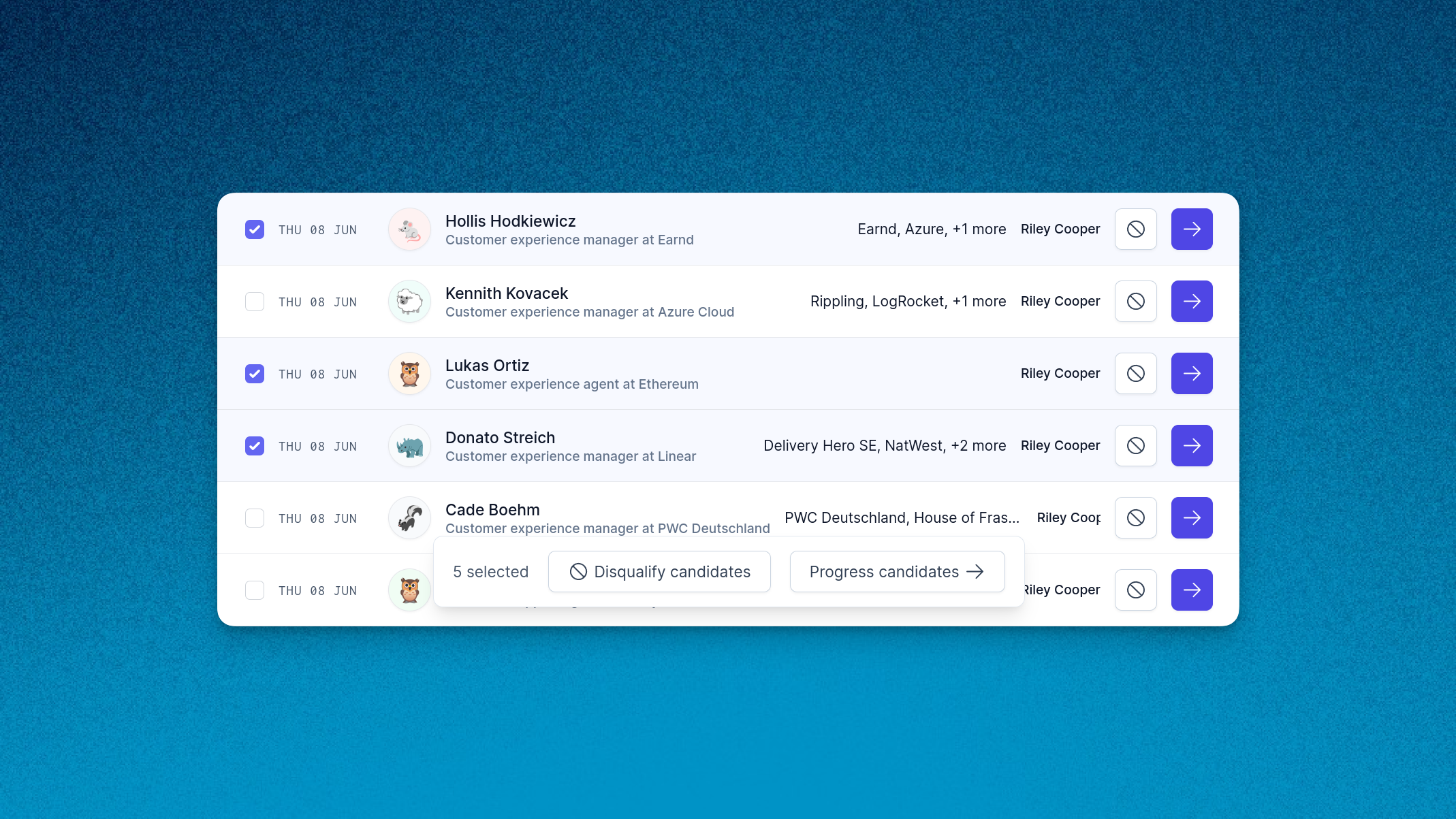
This is only the first of a set of features we are shipping to help you deliver a truly candidate-first experience from the very first interaction candidates have with your company. Stay tuned for more!
Improved navigation
We're constantly looking for ways to improve the Prologue experience, and this week we've made some changes to the way you navigate around the app. Our new top navigation bar lets you drill into applications, insights, inboxes and more, whether for a single role or across your entire team.
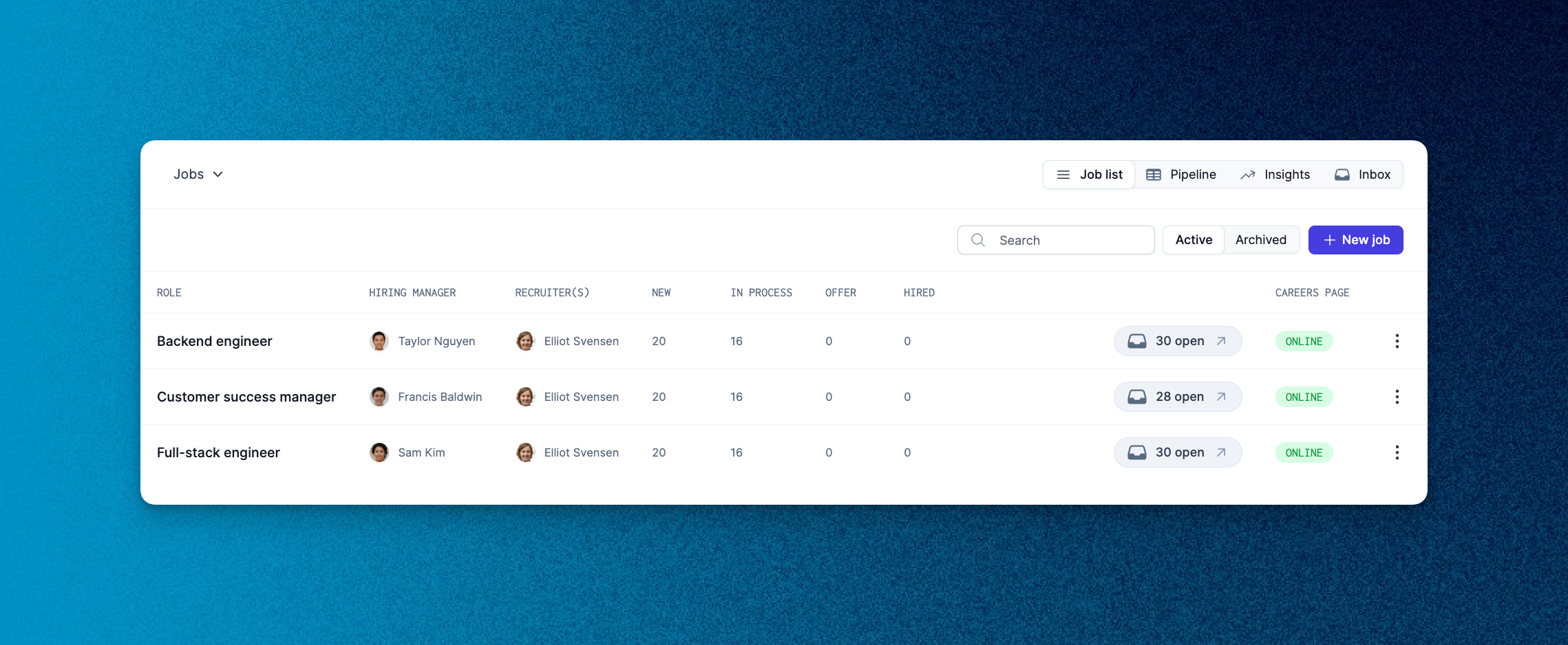
As part of this change we've also revamped the jobs listing page, making more of the most important information and numbers visible at a glance. Let us know what you think!
Improvements and fixes
- We've given the pipeline view a facelift to match the new jobs, insights and application review pages.
- You can now invite team members and manage your team's settings from the improved team switcher.
- Changes to interview evaluations will now be rolled out to all existing interviews which have yet to take place.
Insights and dashboard updates
This bank-holiday week we've been busy working on some larger features, but we've still managed to ship some improvements on our reporting pages and candidate dashboard!
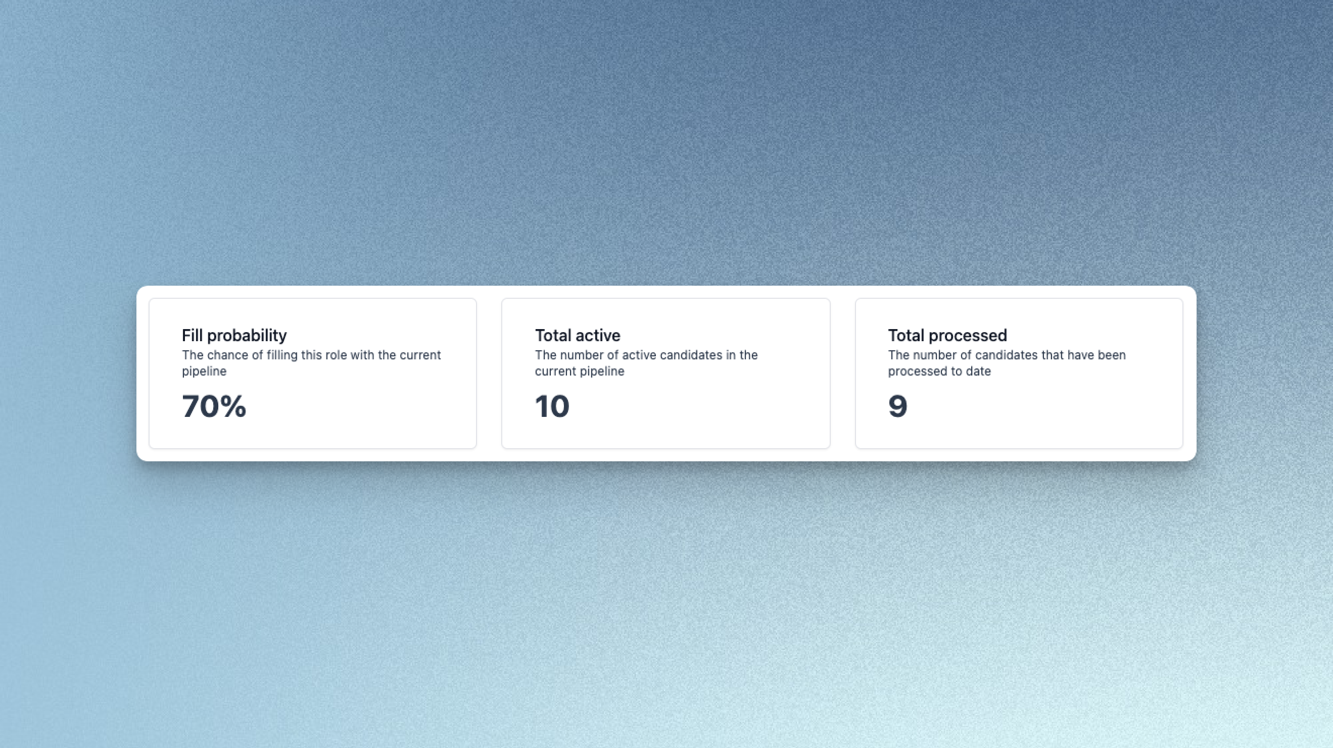
We've been crunching the numbers and we're delighted to unveil fill probability, another step on the road to useful and actionable insights. Worried how an extra stage might impact your pipeline? Concerned that you might not fill one of your open roles? We now take various health-indicators and previous performance data from your pipelines and calculate the probability of the role being filled for any given job!
This score is calculated on-demand so feel free to tweak your pipeline and check back for the impact we think that will have on the probability that the role is filled.
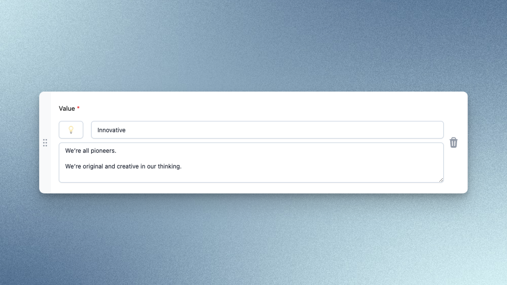
We also received some feedback this week that it would be great to include a description on your company values – and we totally agree! You can now add a longer description to your company values to give more colour to what it's like to work with you.
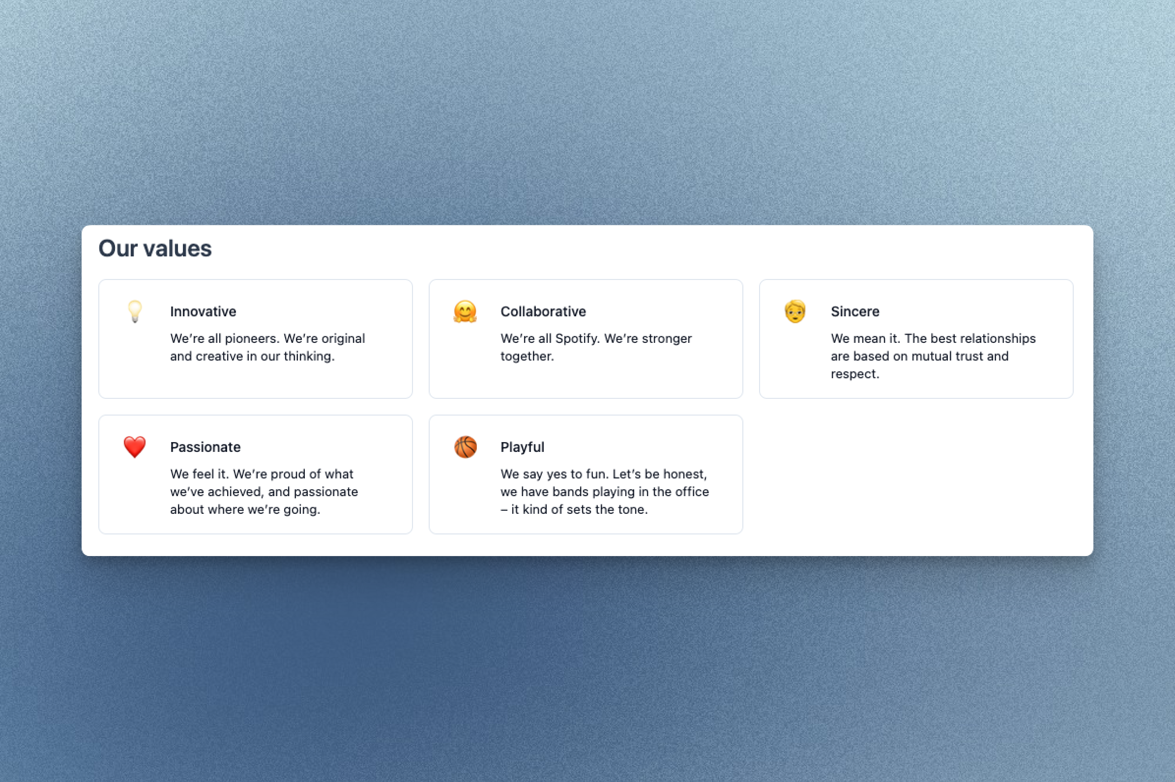
Just head over to the careers page section of the settings page to add descriptions to your company values. They'll be displayed in your careers page alongside your company story, content and FAQs.
Next week we'll be navigating some exciting changes to the way you use Prologue, so stay tuned for more!
Improvements and fixes
- Logged in users are now automatically redirected to the Prologue app from our homepage
Data retention and deletion
Respecting candidates' privacy and managing data responsibly needs to be at the core of any candidate-first hiring organisation. As of today, this is yet another feature that Prologue takes care of for you. The compliance center can now be accessed under Settings by owners and administrators, and allows you to manage automatic deletion of candidate data.
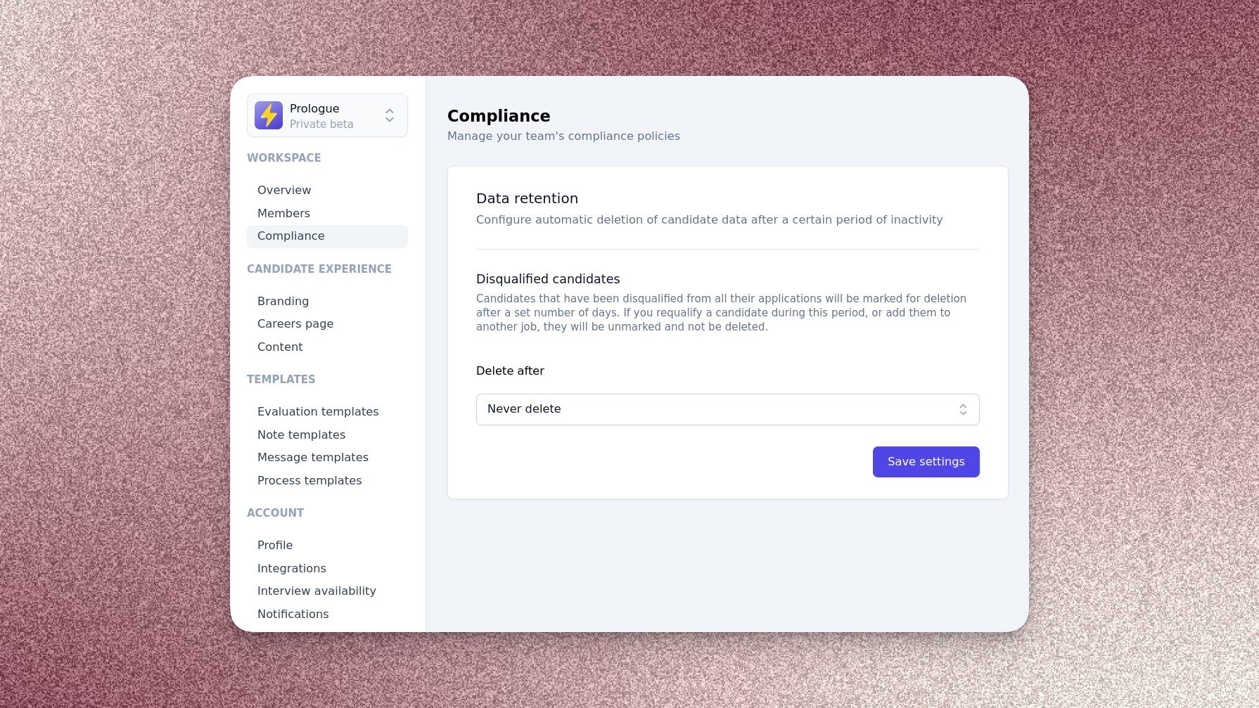
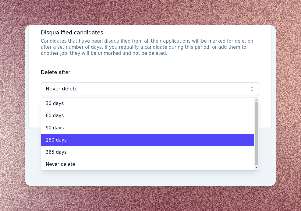
In the compliance center, you can control why and when candidate data will be deleted. At present, Prologue supports deleting data you hold on candidates you have disqualified. When a candidate is disqualified and you have configured a deletion policy, their data will be deleted automatically after the configured period. If during this period you requalify the candidate, or add them to another job process, their data will be retained.
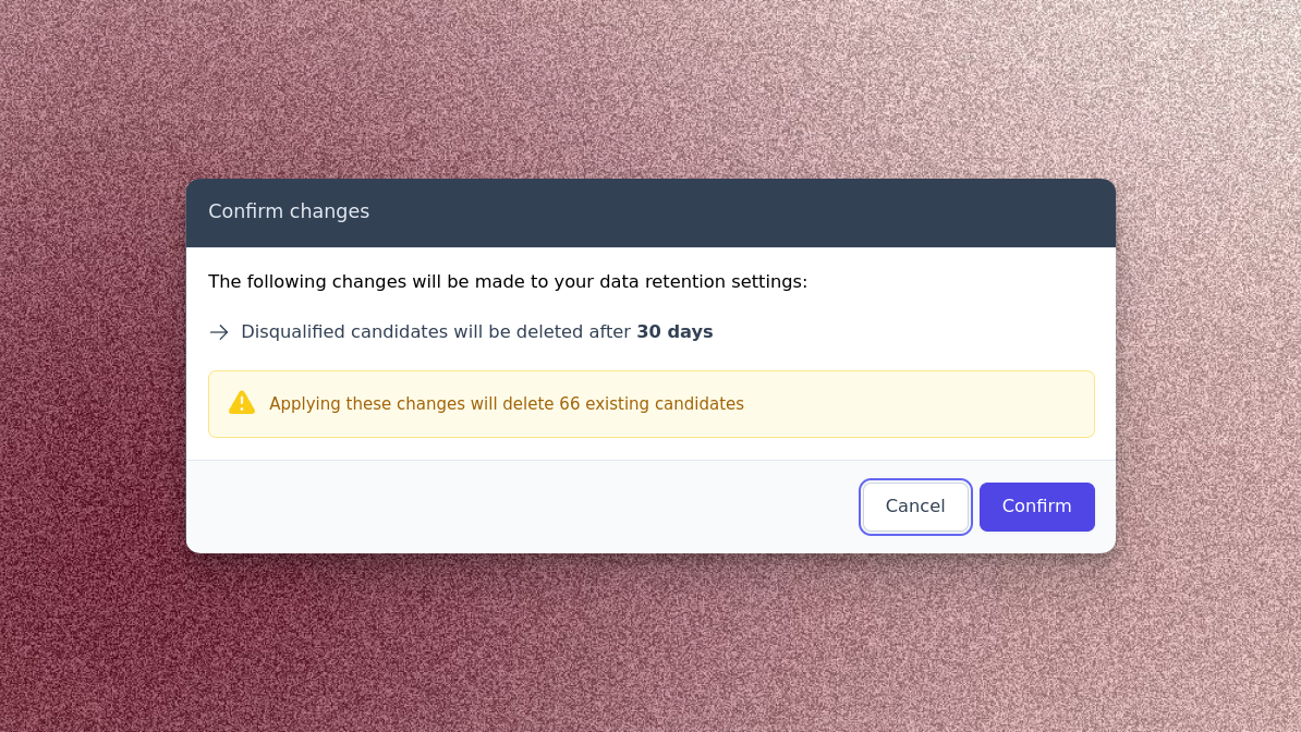
Whenever you change your data retention policies, Prologue will inform you of your changes and the effects they will have on existing candidates, before prompting you to apply them.
When viewing a candidate whose data will be automatically deleted in the next 30 days, you'll see an alert in their process tab letting you know exactly when their data will be removed.
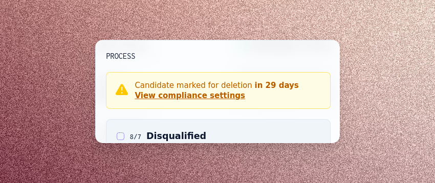
This is just the first of many data governance features we intend to launch in the coming weeks and months – stay tuned for future updates!
Insights
The wait is over! We're delighted to announce the launch of Prologue Insights, a powerful new way to ensure your TA efforts are working. Reporting is by far our most requested feature, and we've worked hard to bring you the first iteration of many.
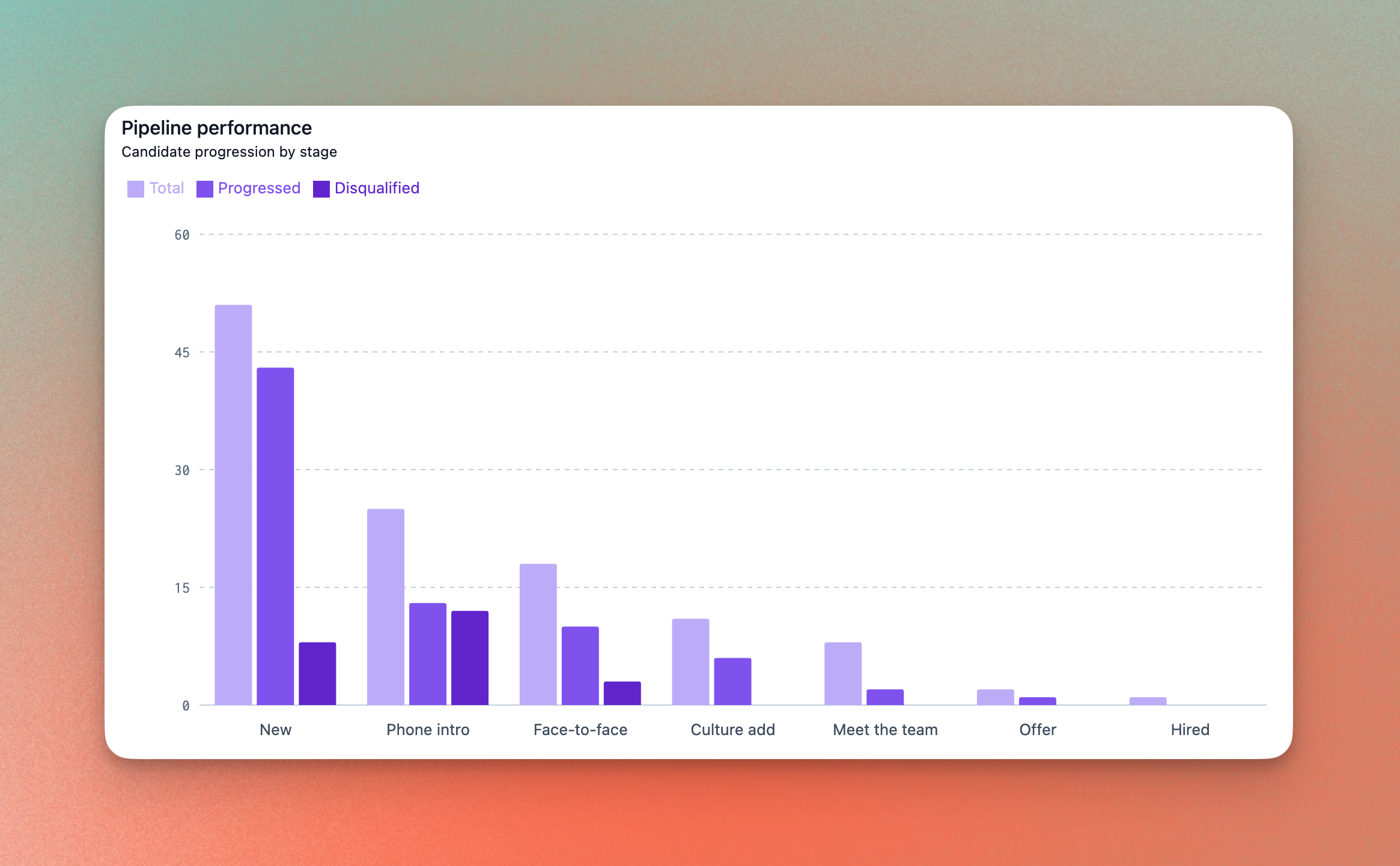
At a job level, you can now track progression through your pipeline. Filter by source, recruiter and date range to understand what's causing any bottlenecks. You can also see organisation-wide KPIs like TTH and offer acceptance rates. Finally, we've built one view with the stage transitions across all of your jobs so you're able to see at a glance where you should be directing your resources.
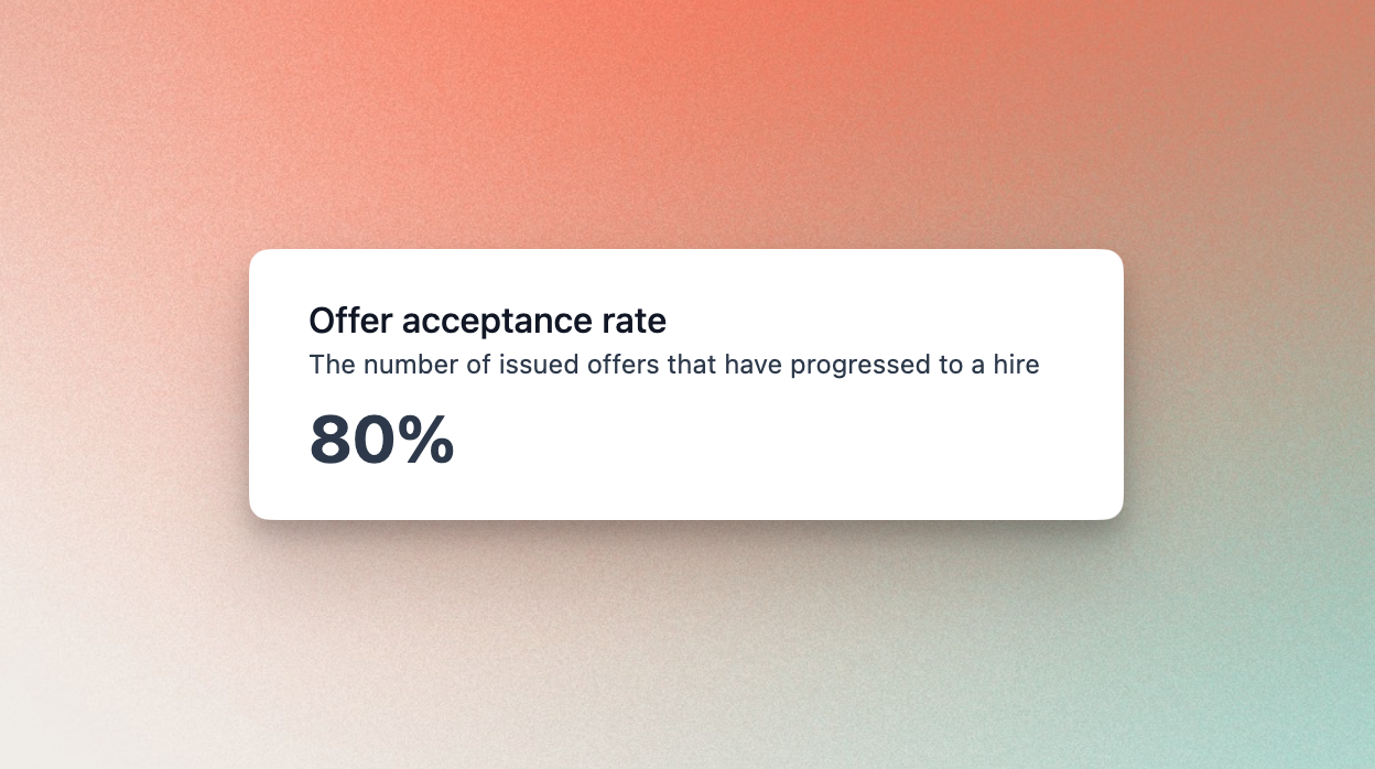
This is just the very start of Prologue Insights. We're going to continue to work on this over the next few weeks so if you have any feedback please let us know.
Diversity, equity and inclusion
Another long-awaited feature is the ability to track diversity, equity and inclusion (DE&I) metrics inside Prologue. Helping you build a diverse team has always been a core part of our vision, so we are excited to be making a start with this release.
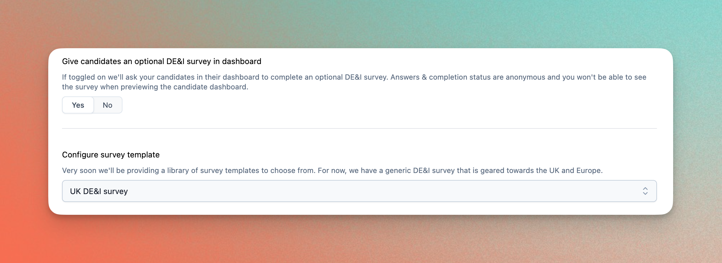
You can add a DE&I survey to your jobs in the job authoring page. For this first release, we have included a pre-built template that contains a set of questions that were picked by reviewing the latest research on promoting DE&I in the workplace. We will be adding more configurability in the future, so please get in touch if you have any suggestions.
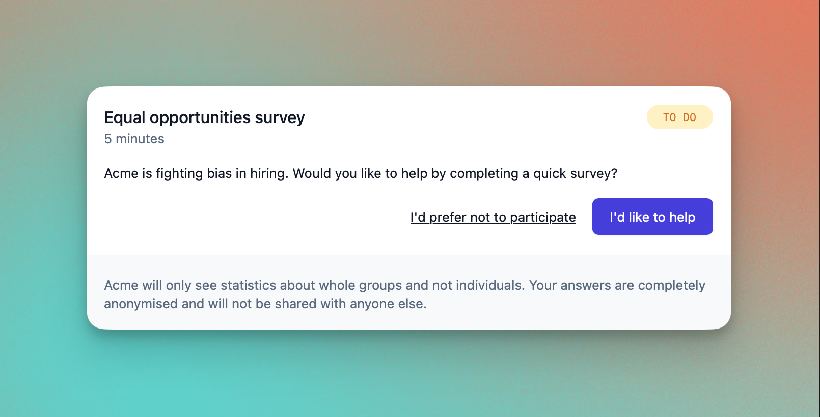
When activated a DE&I card will appear in the candidate dashboard, which will prompt the candidates to complete the survey. We've taken serious measures to ensure the anonymity and privacy of your candidates' data, and we make this clear for their piece of mind. Surveys are also displayed with your branding.
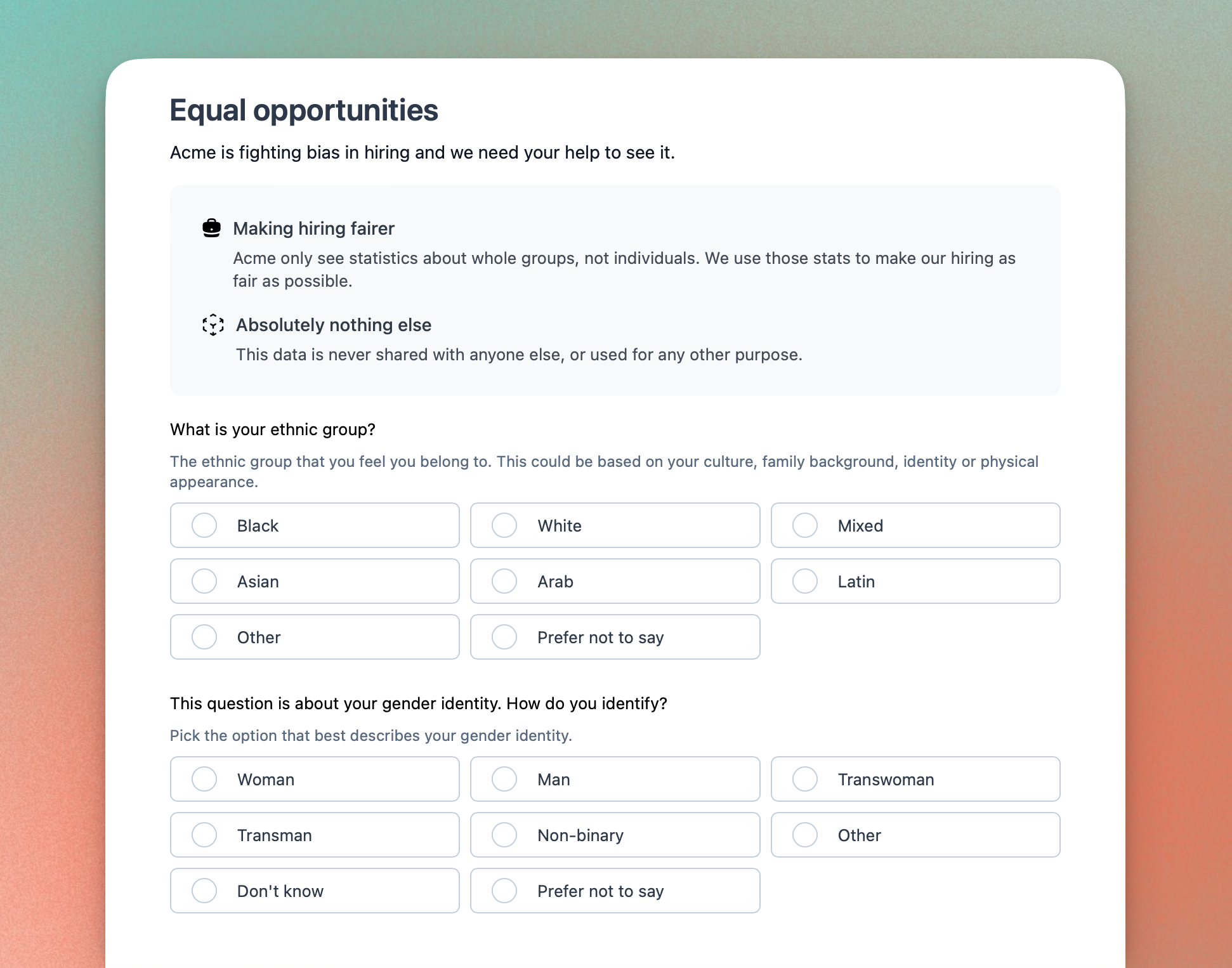
This is just the very beginning of our efforts to help you build a diverse team. We will soon be moving from helping you track DE&I data to acting on it. As a second step we are currently working on the reporting of the survey data - if you'd like to contribute to how that should work please let us know.
Careers site enhancements
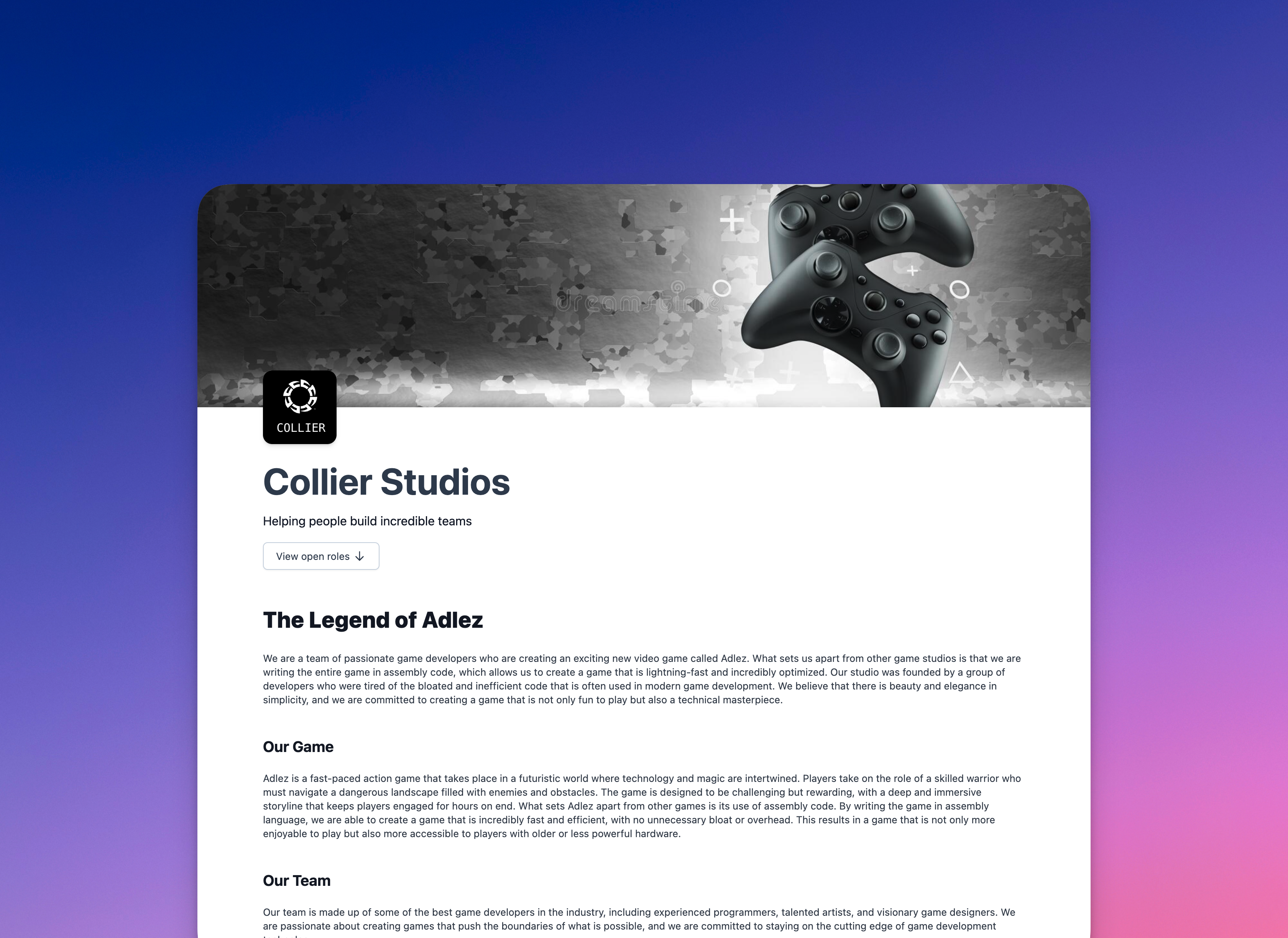
This week we've been hard at work enhancing the careers site so that you can finally say goodbye to Notion! You can now create a rich company story (using Markdown if you wish) which will be displayed at the top of the listings page of your careers site.
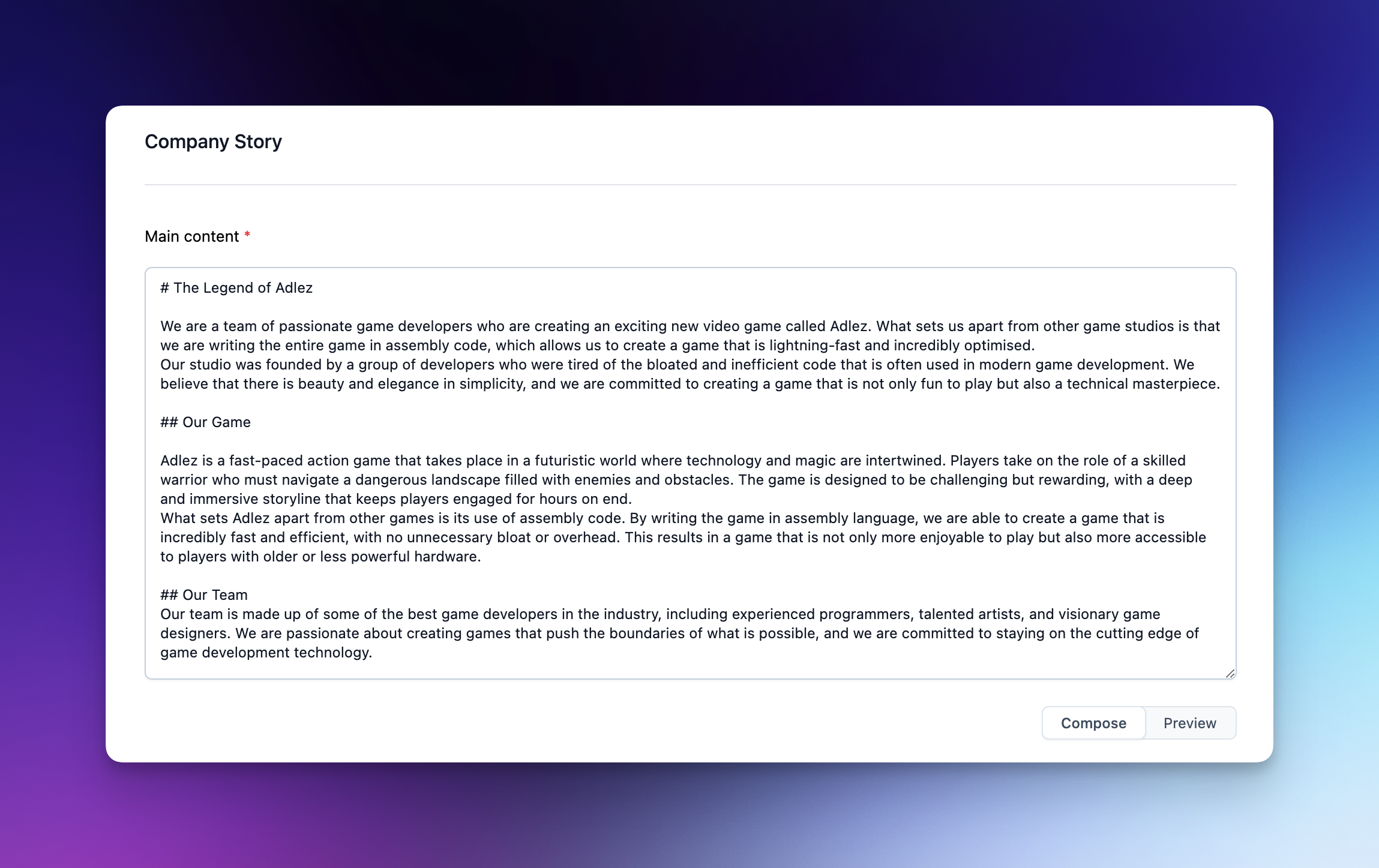
The editor comes with a preview pane so that you can perfect story content before publishing to your careers site.
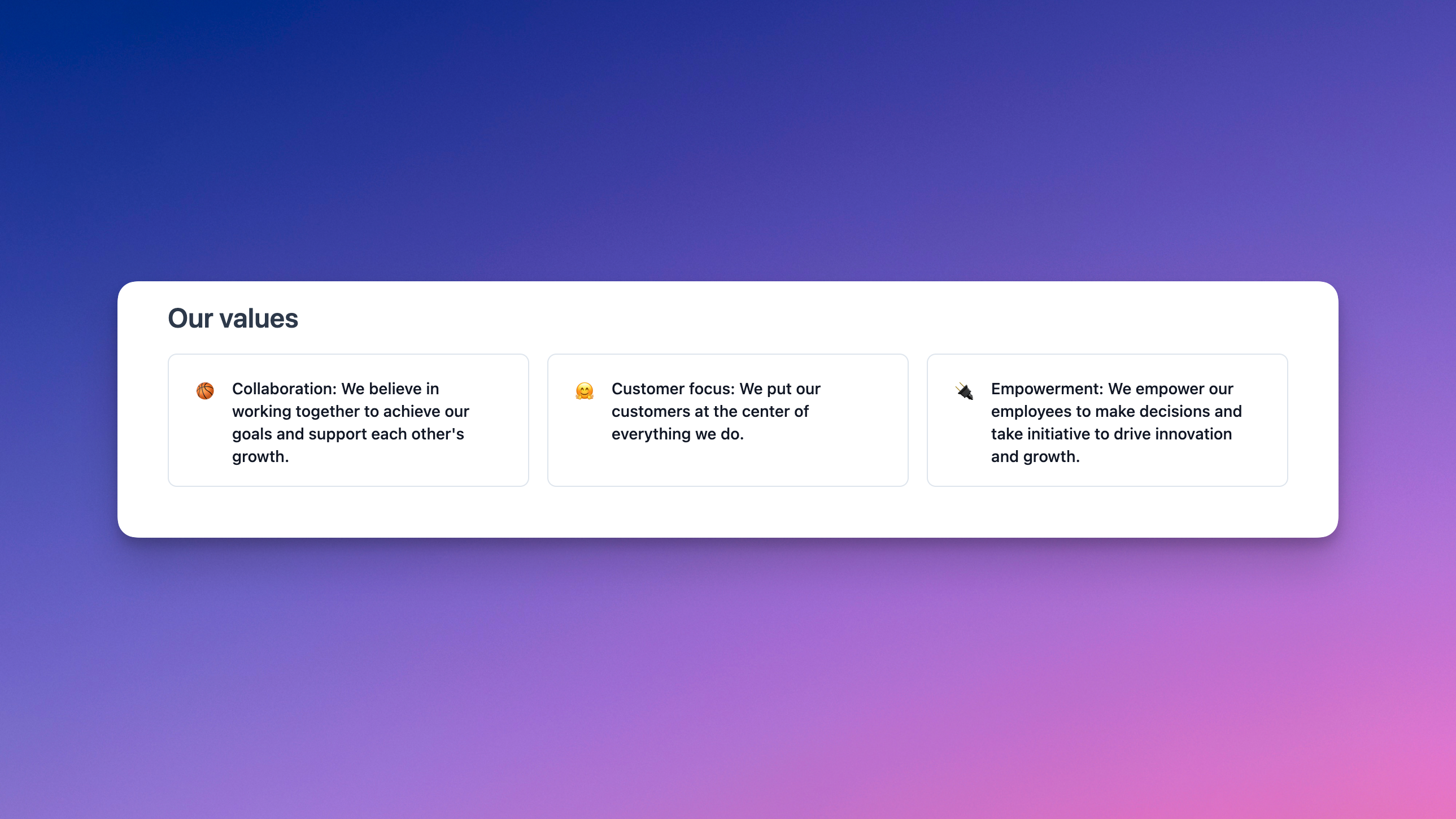
Also in your careers site, we've introduced company values so that you can give a high-impact overview of how you work. Authoring couldn't be easier — simply choose an emoji that best represents the value, and add a sentence or two describing it:
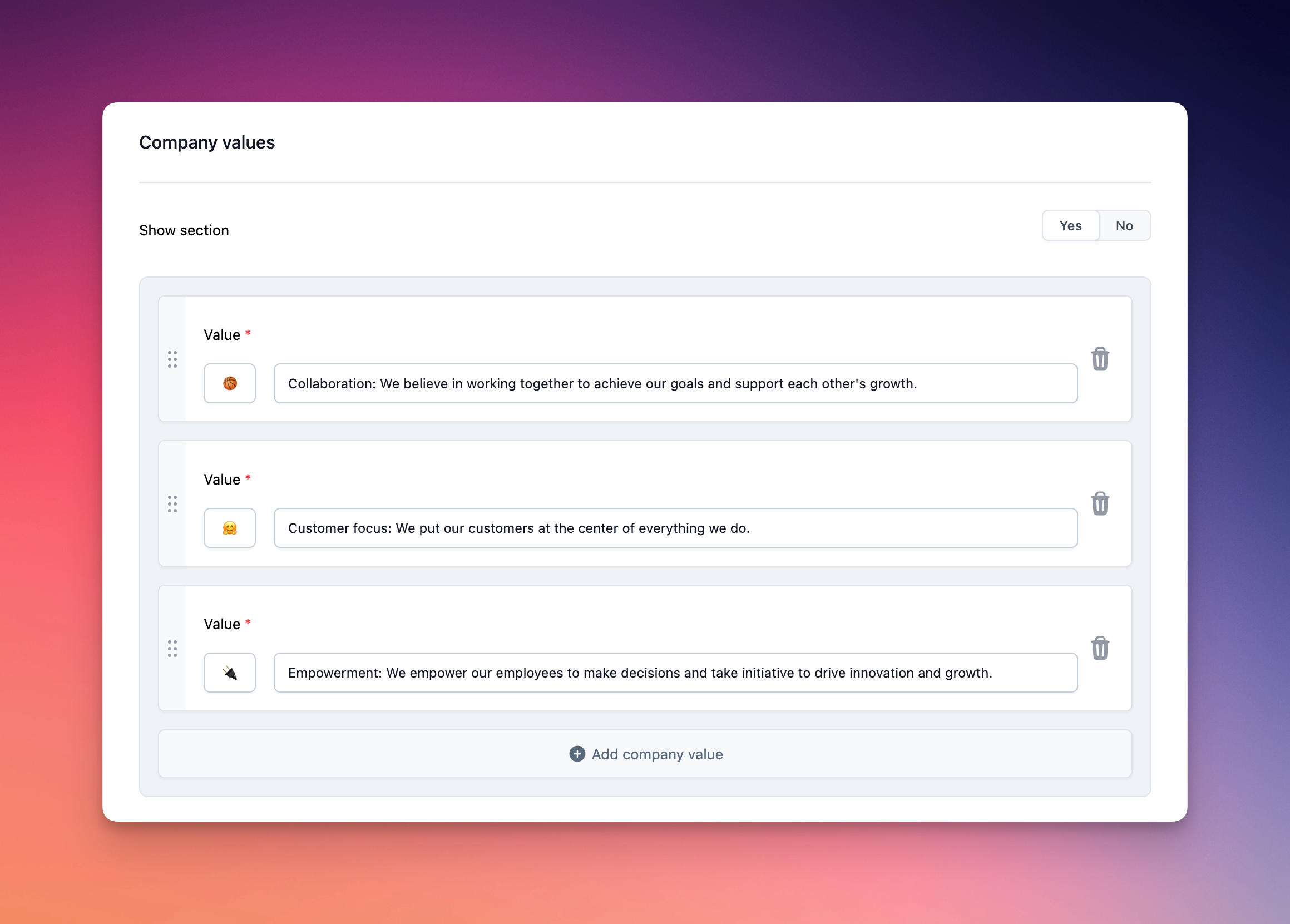
Company values are displayed immediately after your story, so potential applicants flow straight into the heart of what it's like to work in your team.
They say good things come in threes, and this week's careers site enhancements are no exception! Prologue now supports frequently asked questions (FAQs) to help your team to manage candidate enquiries:
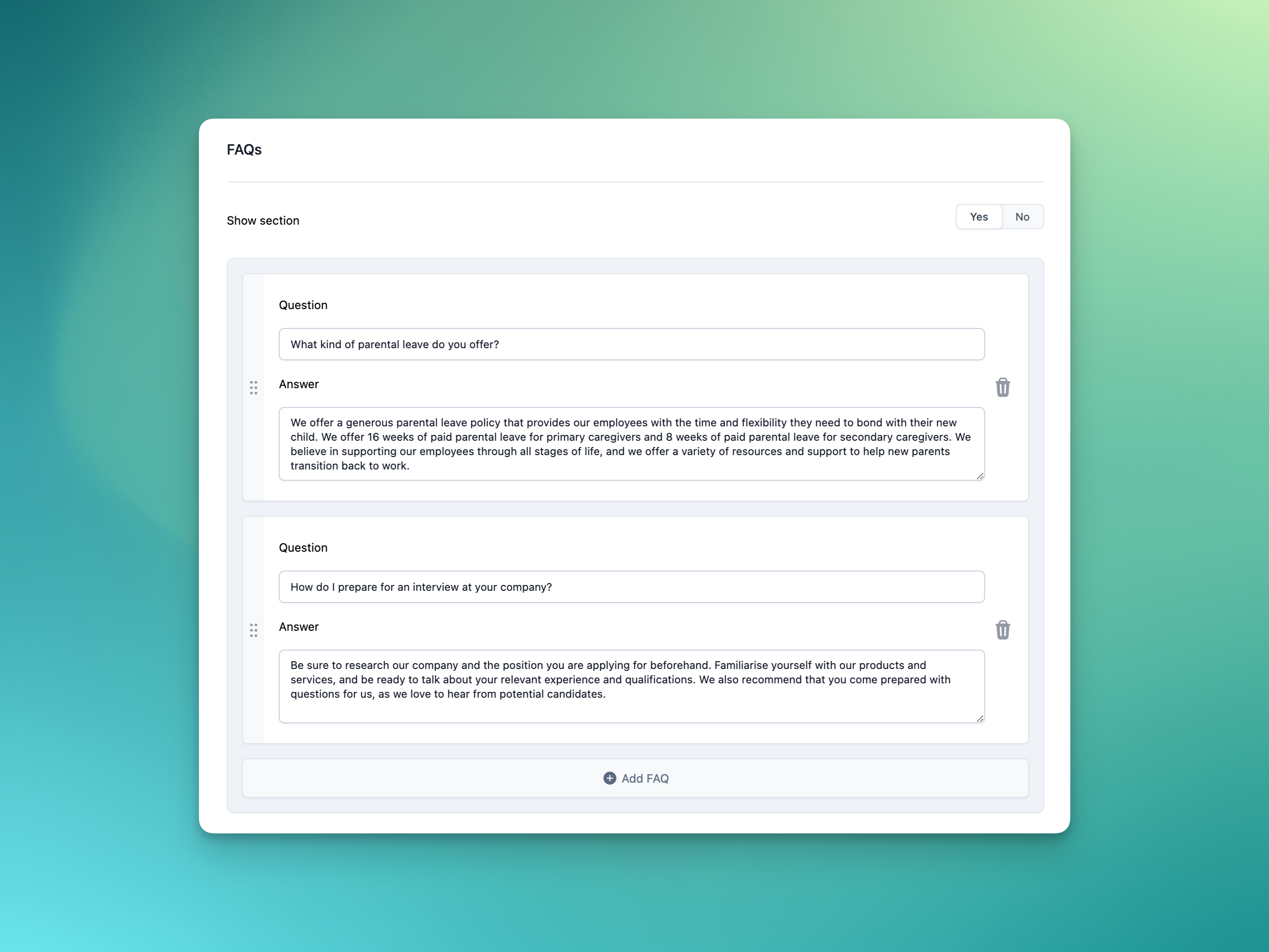
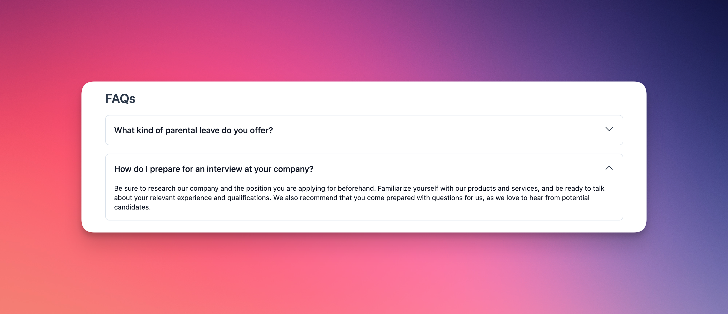
You can add, edit, remove and reorder FAQs in the authoring page and they will be displayed at the bottom of your careers site:
Candidate permissions
One of our most requested features is the ability to control access to certain candidates. For example, maybe one of your team is applying for another role internally, or you've just hired someone and want to add them to Prologue. Introducing fine-grained candidate permissions, which let you manage these scenarios (and more!) with ease.
To manage a candidate's permissions, click the three dots on the candidate's pullover and select the permissions option:
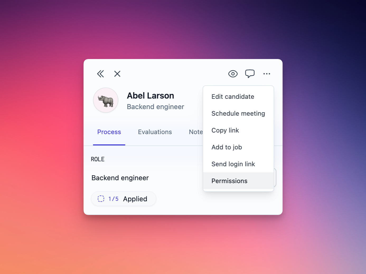
Once in the permissions dialog, you can choose to allow or deny specific people access to the candidate. Candidates with anyone in the allow list will be hidden from everyone except those specified. Candidates with anyone in the deny list will automatically be visible to everyone except those specified.
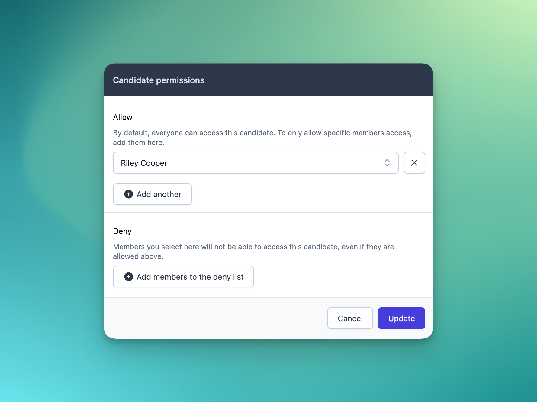
As always we can't wait to hear your feedback on this week's changes!
Inbox filters
This (short) week sees some more powerful filtering tools land in the inbox. You can now choose to see only tasks assigned to a particular teammate (great for covering holidays!), of a particular type (if you like to book all your meetings in one go) or pertaining to a particular role (that you're this close to filling).
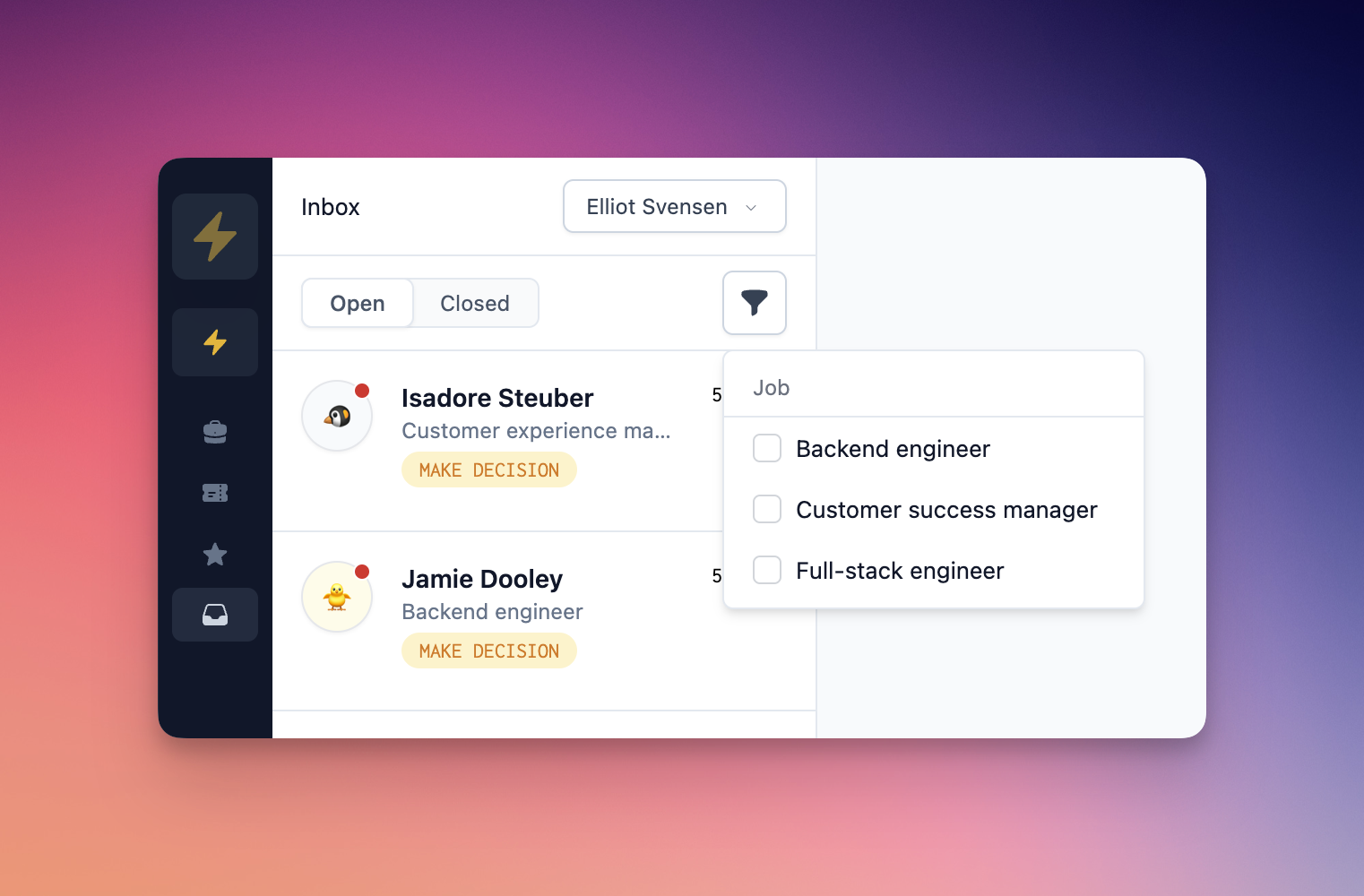
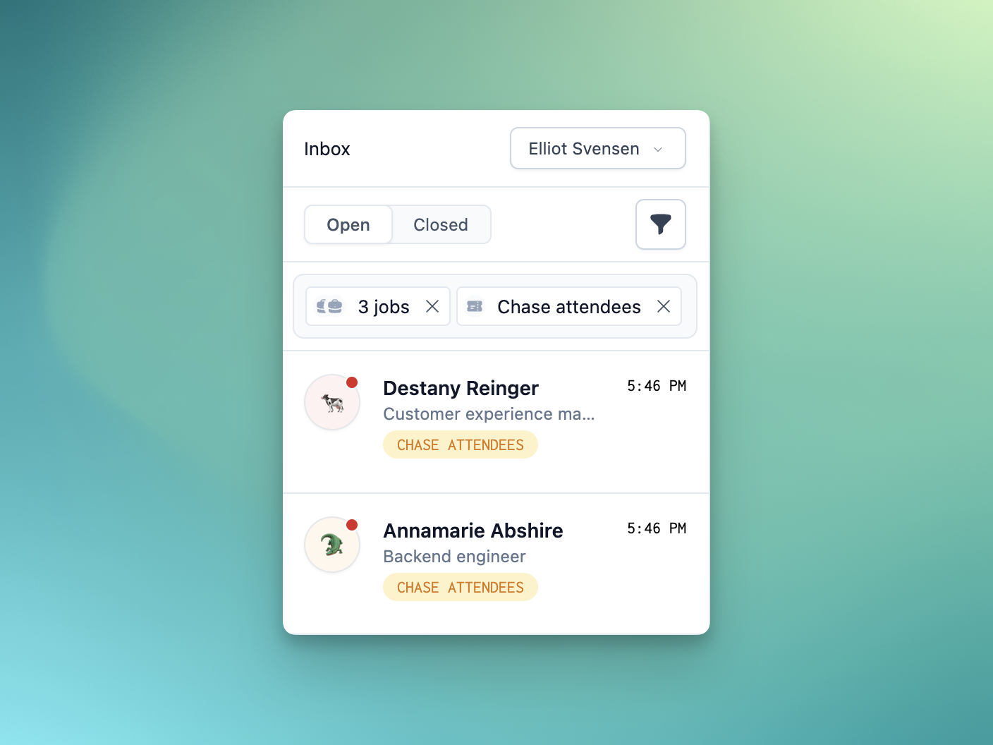
Next week we'll be shipping some bumper changes across the product, touching both candidate and teammate experience – stay tuned!
Careers site
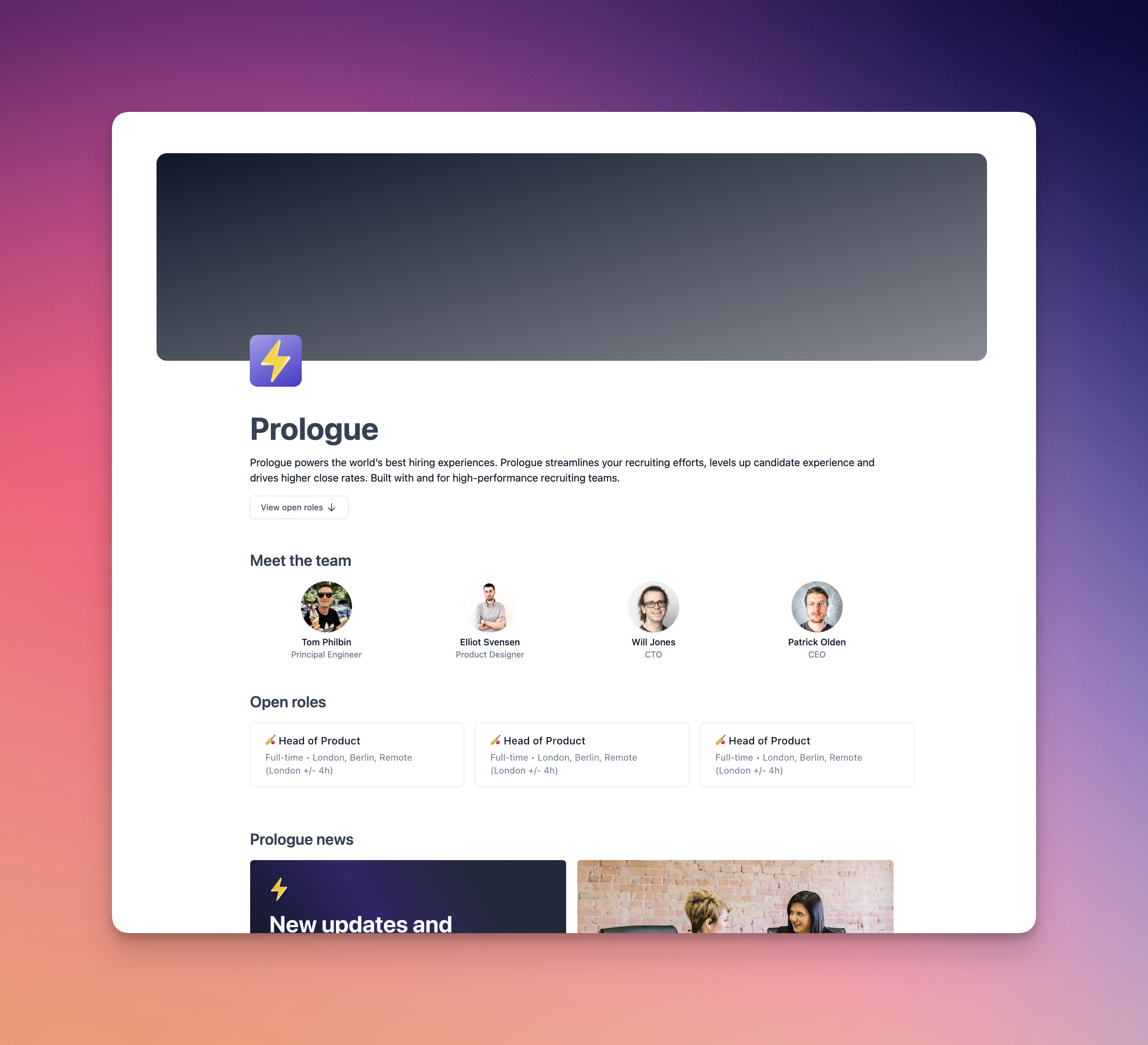
Introducing our new job listings page on the careers site! Your team is now front and centre, showing off your best assets, and your content squares are displayed right next to your open roles.
We'll be doubling down on candidate experience in the coming weeks, giving you more control over how everything looks across your careers site and candidate dashboard, as well as allowing you to provide more content to really show off your company… watch this space!
Interview Listings Page
The interview listings page has also received some attention, making it easier for you to see the most important calls you'll have this week.
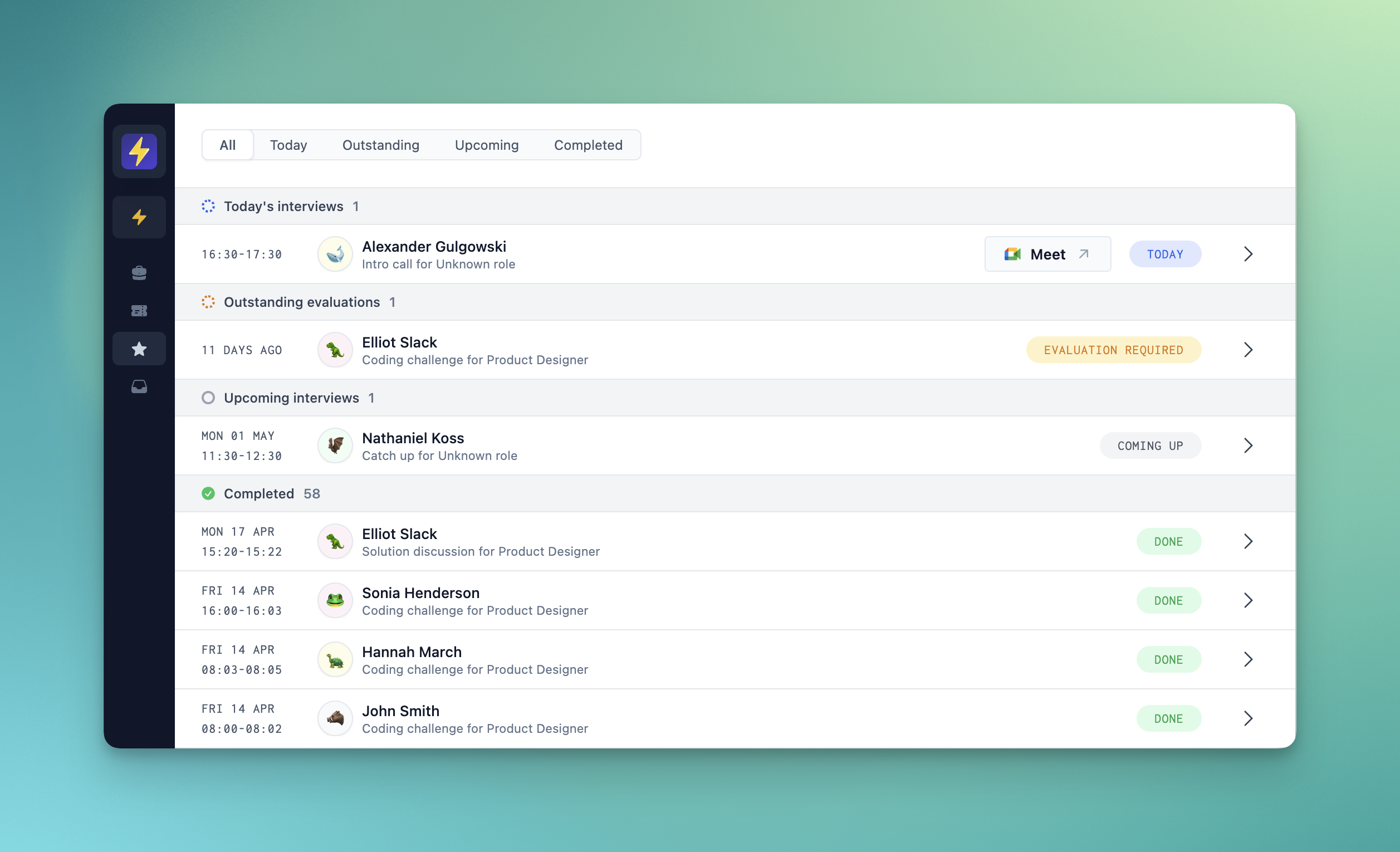
Our redesigned page now has grouped interview list items and a toggle to quickly filter between sections.
Improvements and fixes
- Teammates mentioned in latest comments in the pipeline are now highlighted according to their role.
- Evaluation scores now replace note scores in the pipeline.
Evaluation templates
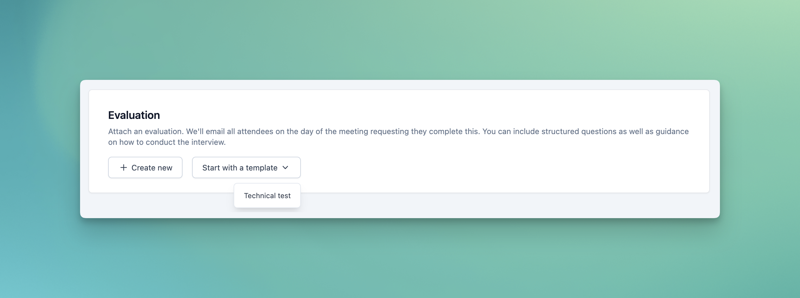
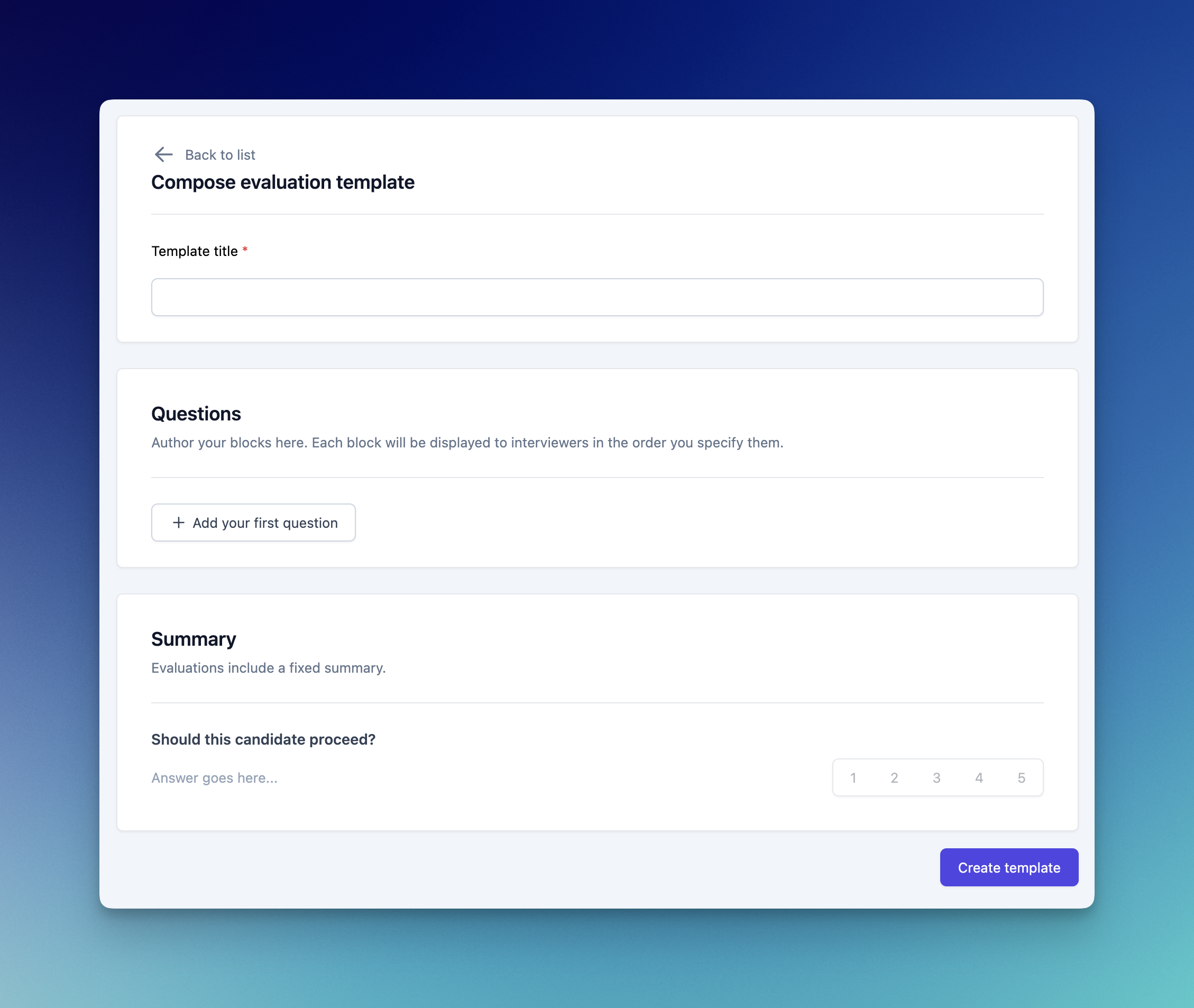
If you're hiring for a number of similar roles, or have standardised stages across several processes, evaluation templates are here to make your life easier. Compose and save lists of questions; interview notes and preparation kits; and mark schemes for use across multiple jobs, stages and meetings.
Notifications

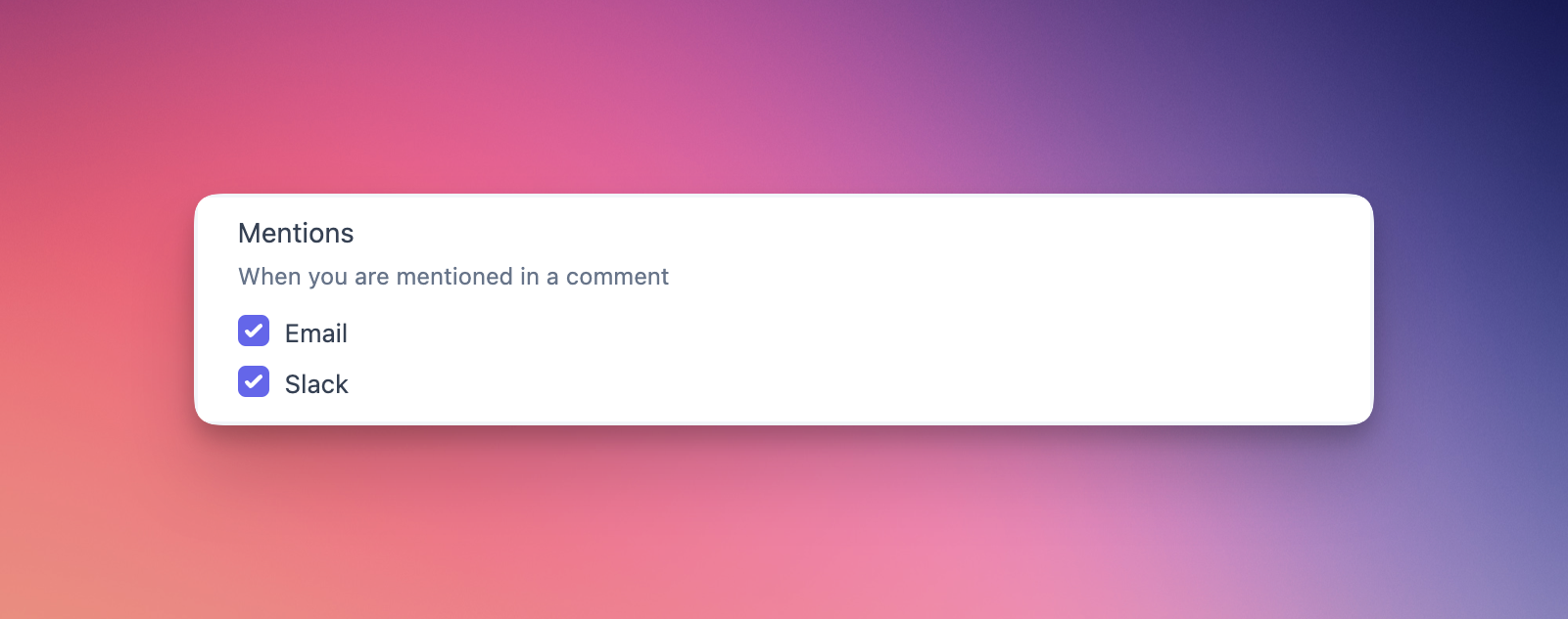
This week we've revamped and unified our notifications system. All of Prologue's notifications are now fully customisable, so you can decide when and where you are kept up-to-date on your hiring. Whether you want to keep things in your email inbox, Slack, or both, we've got you covered!
Improvements and fixes
- You can now use Ctrl+Enter/Cmd+Enter to send messages and submit comments in the candidate overlay and inbox.
Evaluations
We've shipped evaluations on Prologue! You can now use our block-based authoring to add evaluations to your meetings, just head over to a stage in the create/update job page to get started.
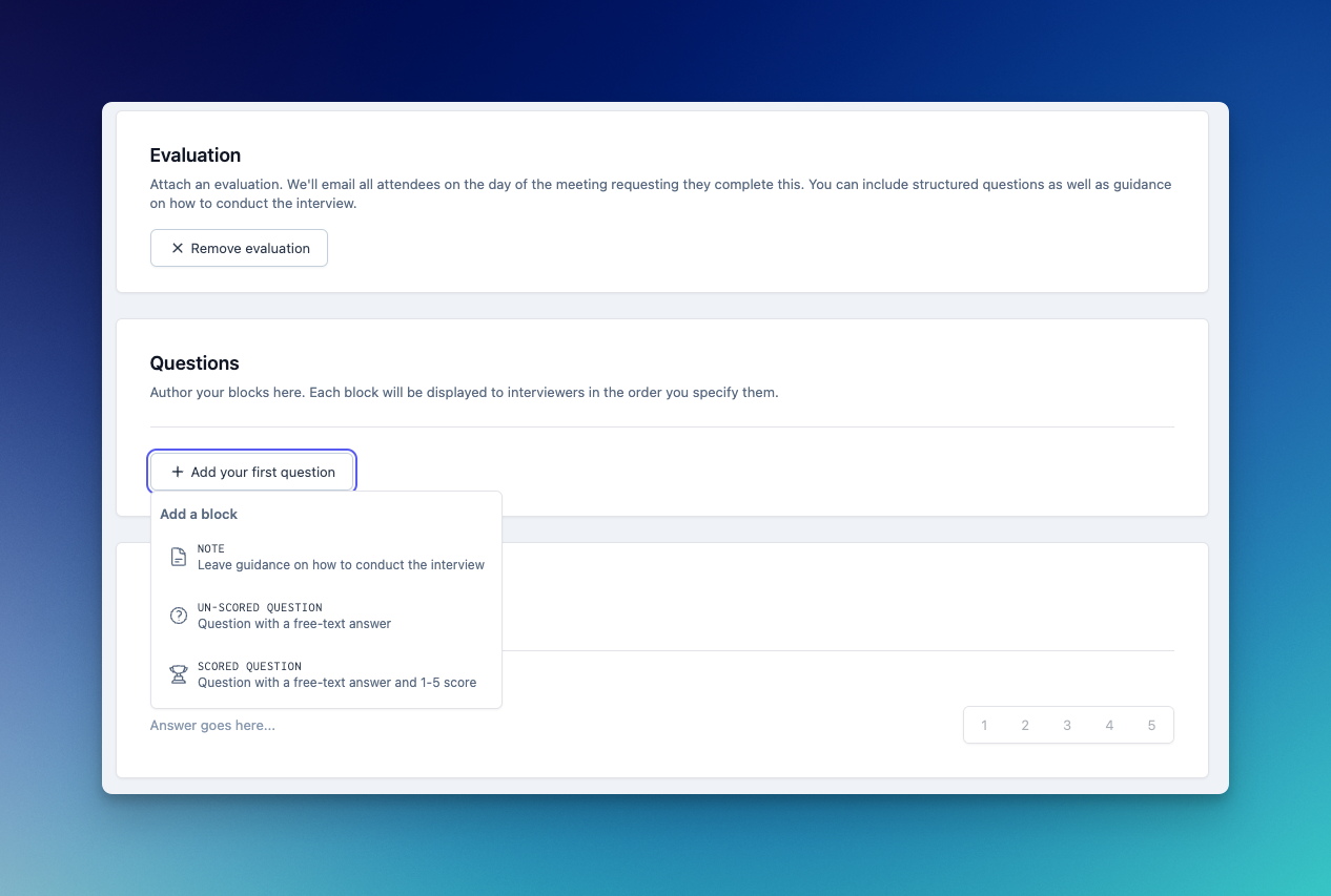
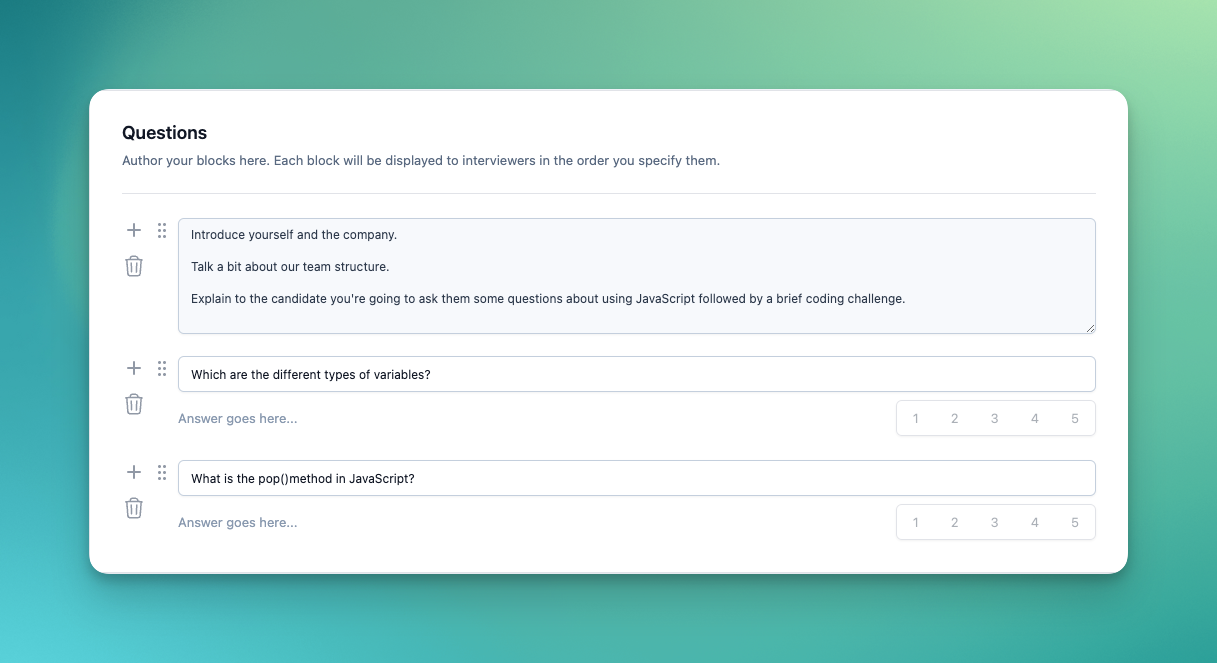
Evaluations can have scored and un-scored questions, as well as notes to help guide your interviewers through the questions.
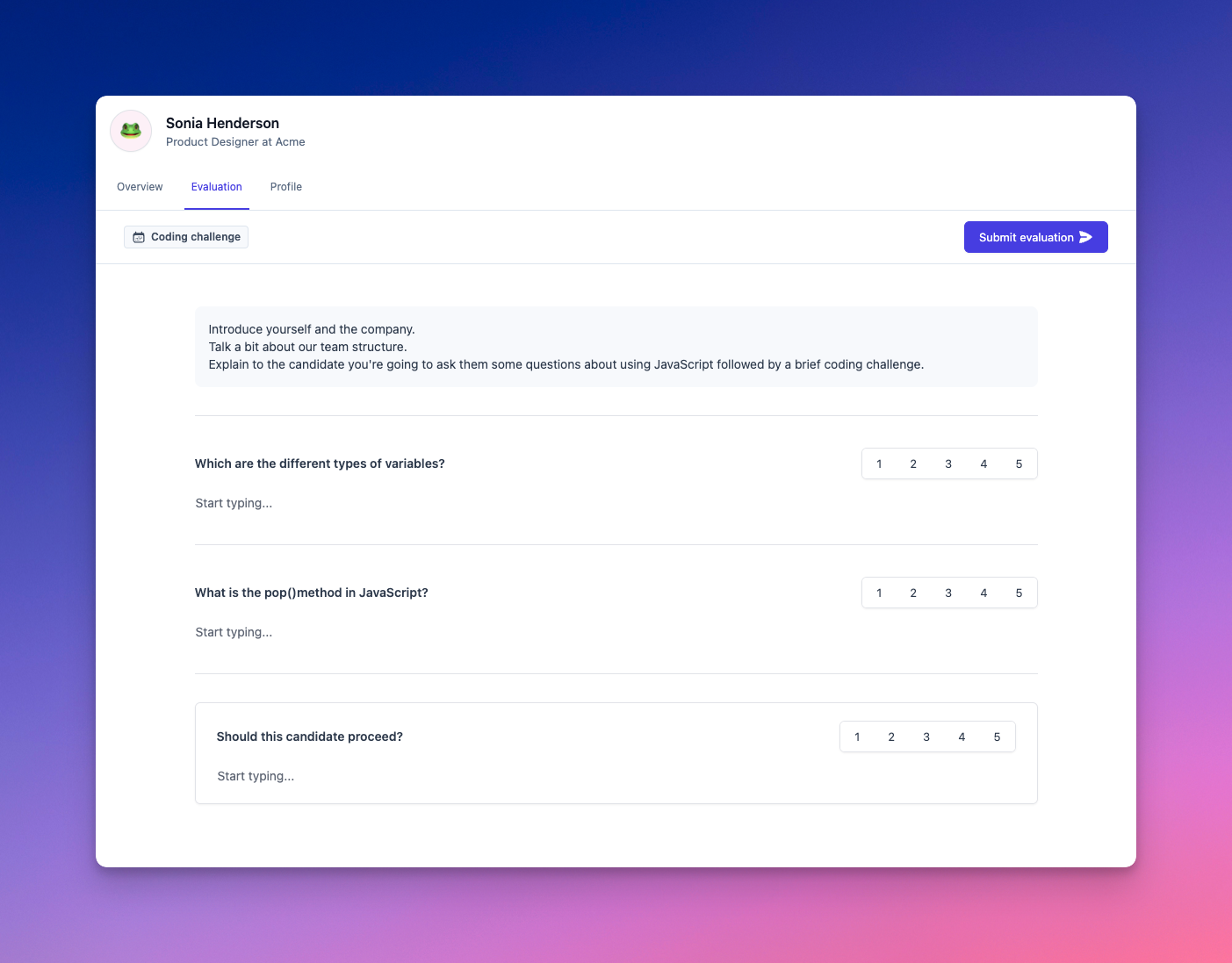
Once added to a meeting, interviewers will be prompted to fill out the evaluation in our new Interviews page which is accessible directly from the left-hand navigation. The interviews page shows all of your upcoming meetings – even those without evaluations – as well as past meetings. From here you can dive into the interview kit which includes overview and candidate profile pages, as well as the evaluation page.
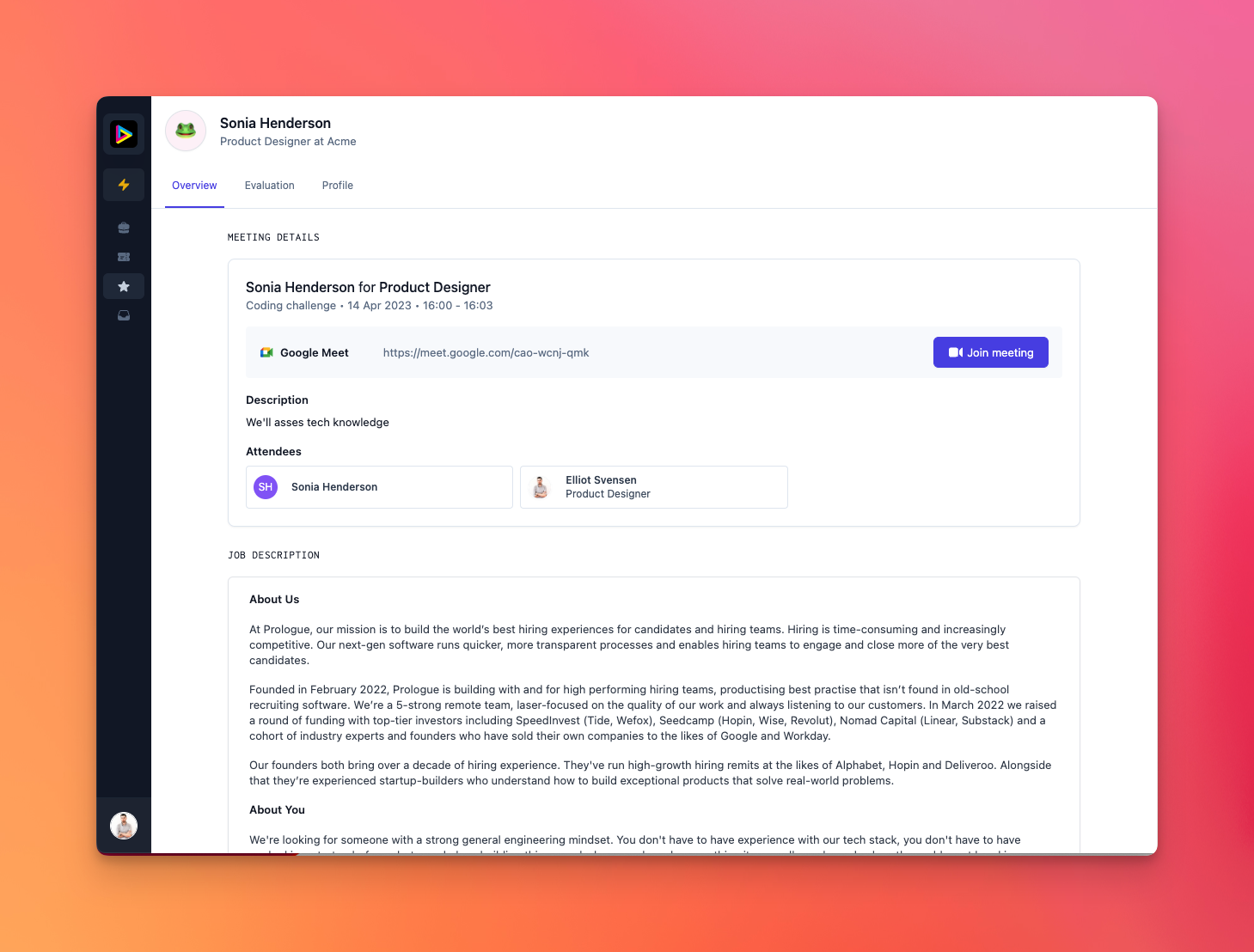
Completing an evaluation is as easy as filling out the questions and hitting the submit button. Everything is saved as you type, so there's no need to think about anything other than the candidate! All evaluations include a summary block which interviewers can use to give an indication on whether a candidate should proceed in the process.
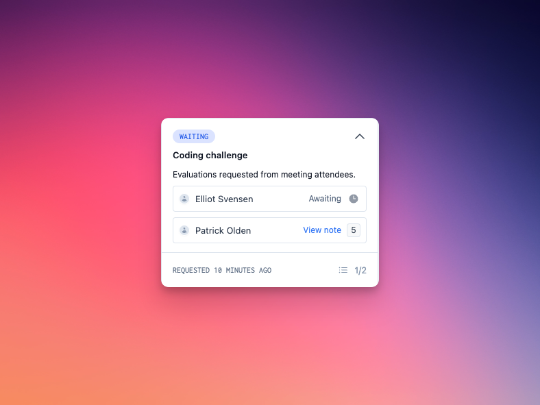
Evaluations integrates deeply with our inbox, so recruiters are automatically prompted when evaluations are outstanding, as well as when all have been completed and decision is needed.
We'll be improving evaluations and adding more features in the coming weeks, but we can’t wait to hear your thoughts and feedback!
Improvements and fixes
- The candidate list can now be filtered by job in the inbox.
Comments
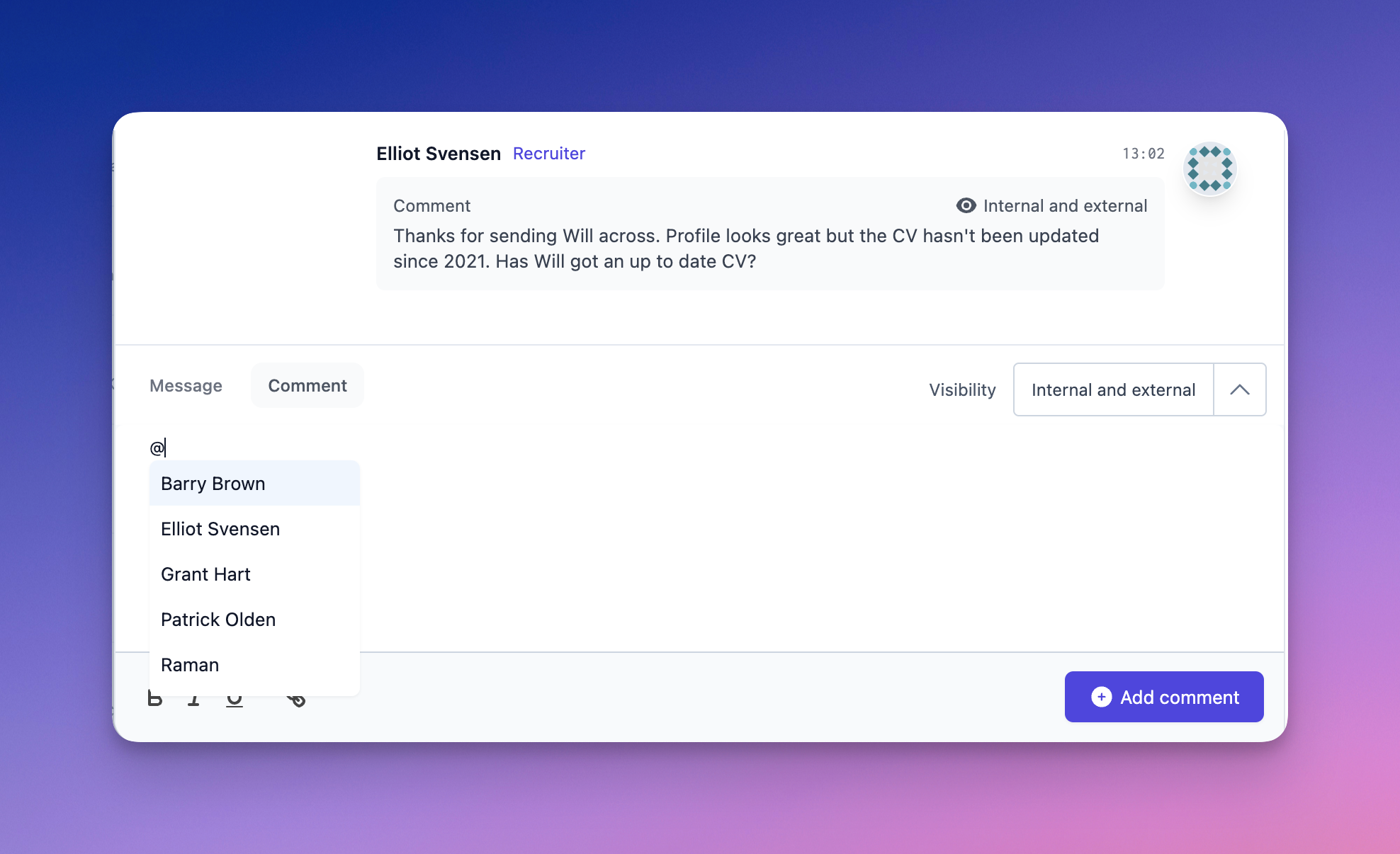
Comments are here! Comments allow you to, well, comment, on candidates and their applications, and fill the gap between messages and full-blown notes or evaluations. Like notes, comments are never visible to candidates, and appear in a candidate's feed alongside other updates:
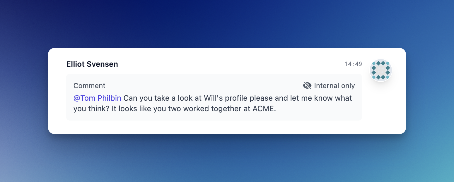
Use @-mentions to communicate with other members of your team. Colour coding lets you quickly see who's who, showing recruiters, external partners and other team members. If you're working with agencies or external support, control comment visibility on a per-comment basis as you see fit:
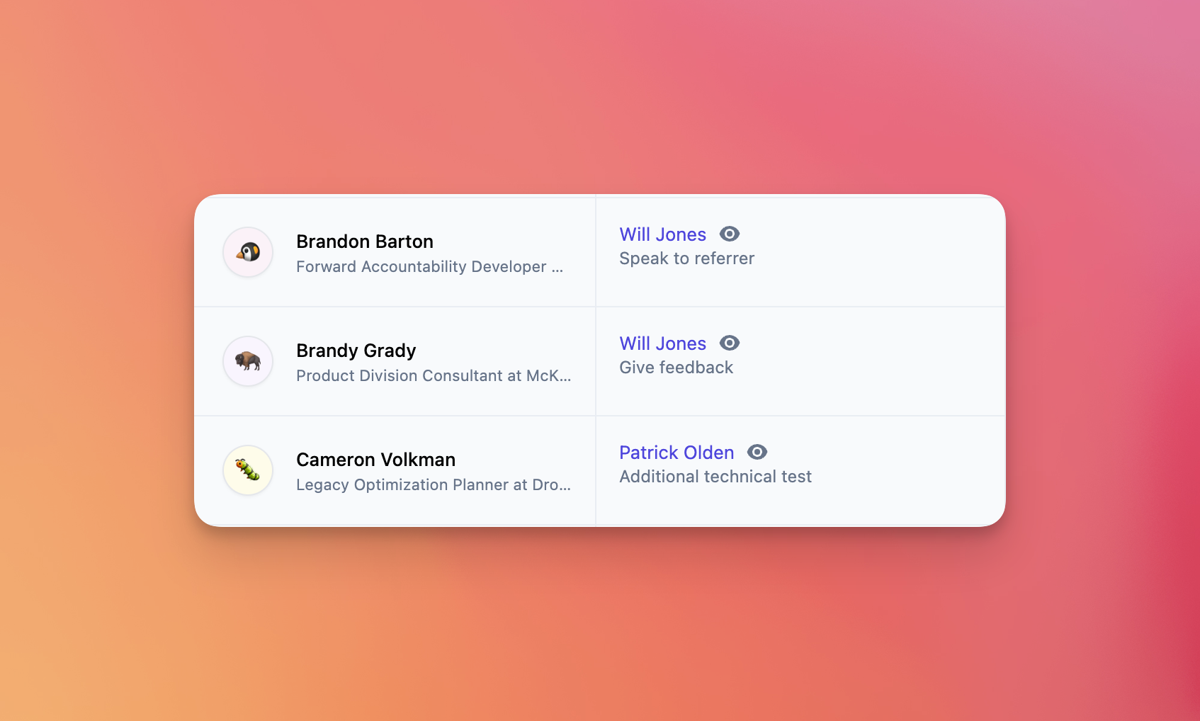
Comments replace “next steps” in the pipeline, giving you the same quick overview of a candidate's status with a much richer audit trail of who said what, when:
Improvements and fixes
- The feed has been powered up, grouping messages and comments from individuals and more clearly displaying authoring information.
- Notes on candidates submitted by external recruiters will now come through as comments and not notes, making it easier to glean more about new submissions at a glance.
- We've removed the “latest experience” column from the pipeline in favour of showing this information alongside the candidate's name. This frees up more space for more important details.
Waiting tasks
Last week we launched meeting stages, and with them the first iteration of tasks. Tasks help you and your team focus on delivering amazing candidate experiences by letting you know what needs to be done, and when you need to do it.
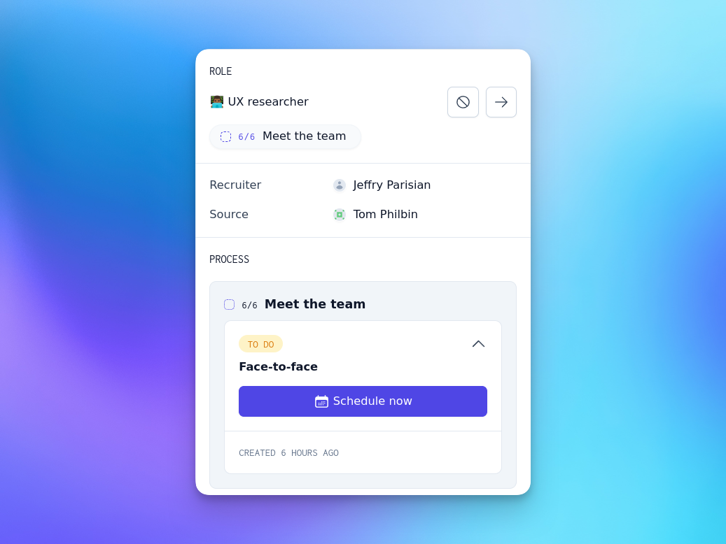
That said, it's also important to know when you're waiting for inputs from others, such as colleagues or candidates themselves. Enter waiting tasks. Waiting tasks let you see the status of every candidate at a glance, whether there's an action to be taken or not:
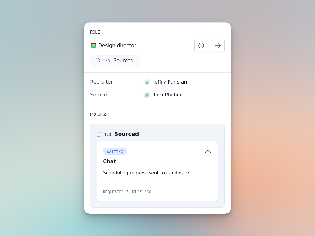
Of course, nobody wants to wait forever. Every waiting task has a chase task backing it up — if things are taking too long, we'll help you get them back on track by reminding people to hold up their end!

Kanban task workflows
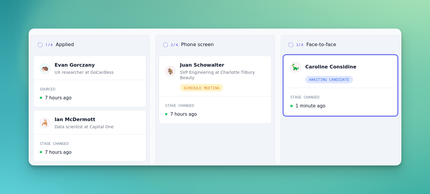
If you want a snapshot of all the candidates applying for a given job, the Kanban board is a great place to visit. As of this week, we've also powered up candidate cards with tasks, so that you can now not only see where all your candidates for a given job are, but what needs to be done to move them forward!
Improvements and fixes
- Upon signing in, you'll now be redirected to the jobs page instead of the pipeline, giving you a better opening overview of your open roles and active candidates.
- We've released a number of fixes that make it easier to author jobs and organises the stages within them, as well as better descriptions of the parts you can customise.
Show off your amazing people with enhanced biographies
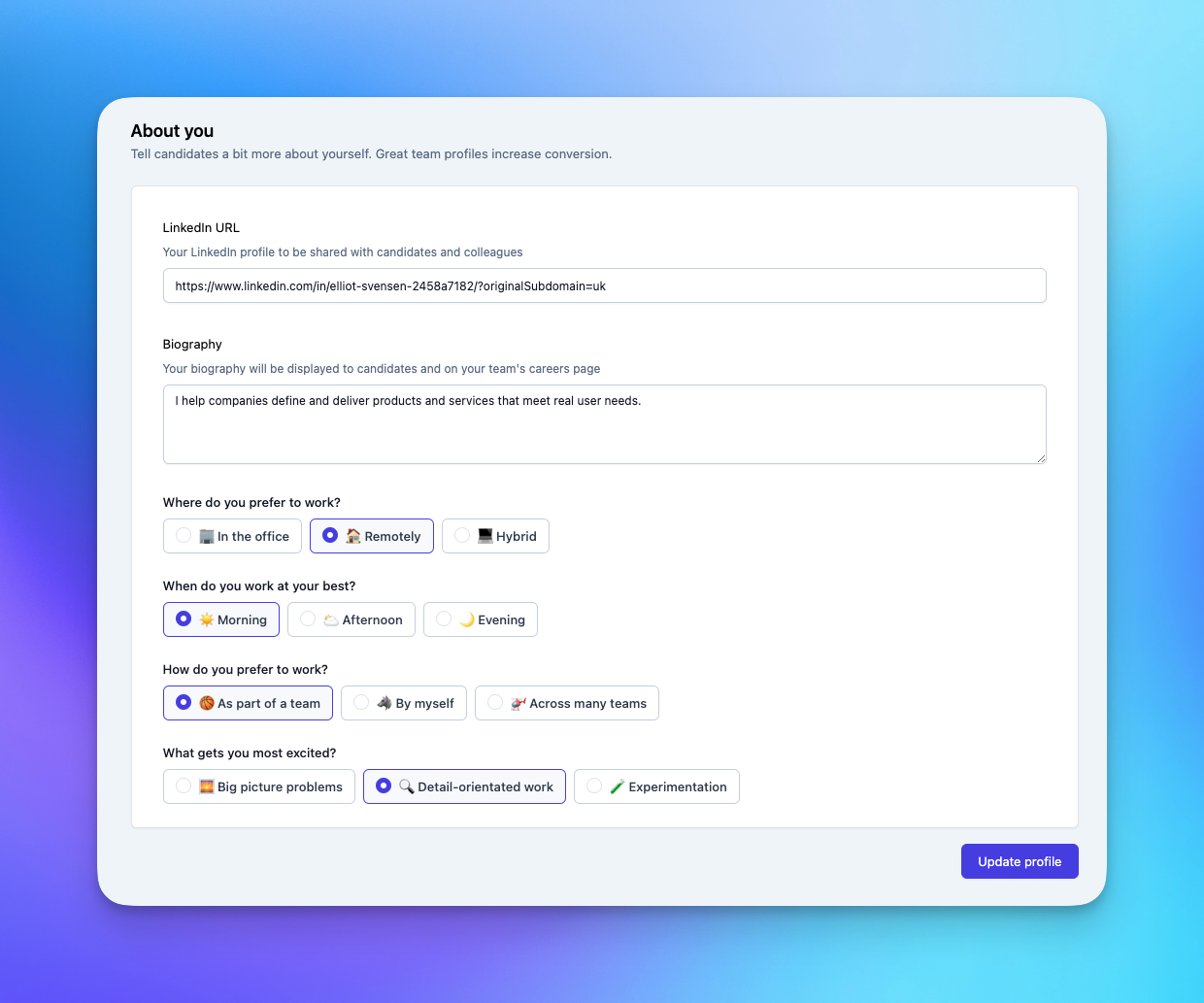
It's time for your team to shine. With enhanced profiles, you and your team can share your experiences, passions and working styles.
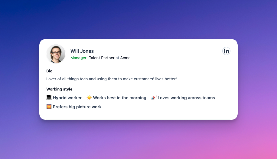
Give candidates even more up-front insight about why they should apply and join you. It's time to say goodbye to the days of waiting for emails and interviews to get to know potential colleagues.
Meeting stages and tasks
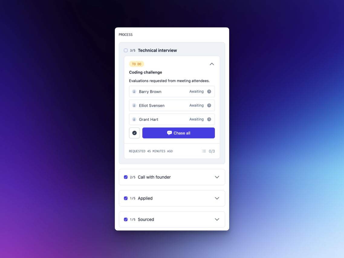
We're focusing on the science so that you can perfect the art. This week we've shipped the first of many features we're implementing to help you streamline your hiring and avoid drudgery. Introducing meeting stages, which allow you to define processes for scheduling interviews and catch-ups with candidates:
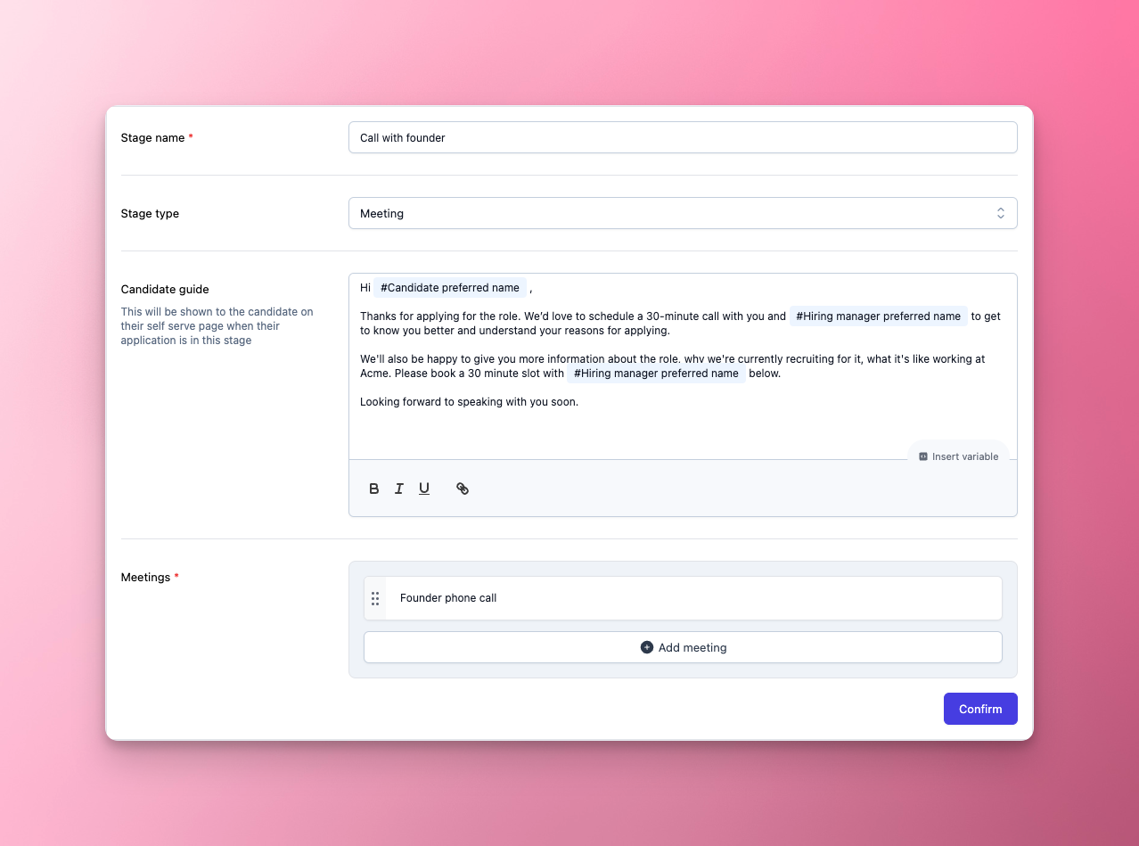
Meeting stages come equipped with their own set of tasks, that can help prompt you to schedule meetings, chase candidates or attendees, or make a decision on whether a candidate should progress. Don't waste time working out what the next action that needs to be taken is — we've got your back.
More on candidate experience
We've shipped even more updates to the candidate dashboard this week, as well as some tweaks to our application forms. Candidate experience just keeps getting better.
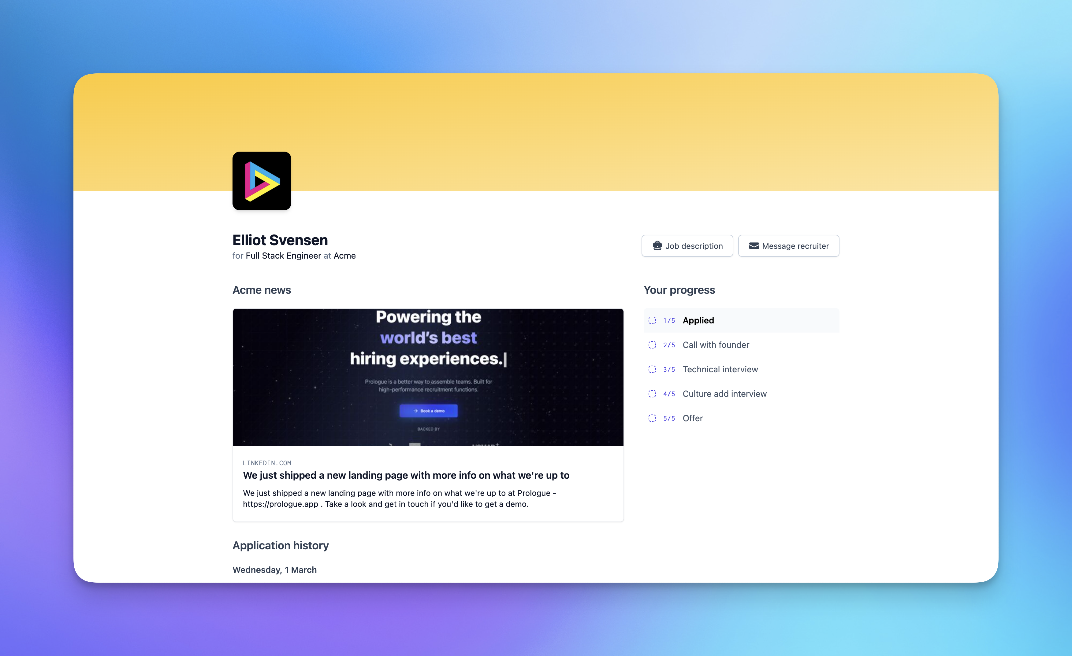
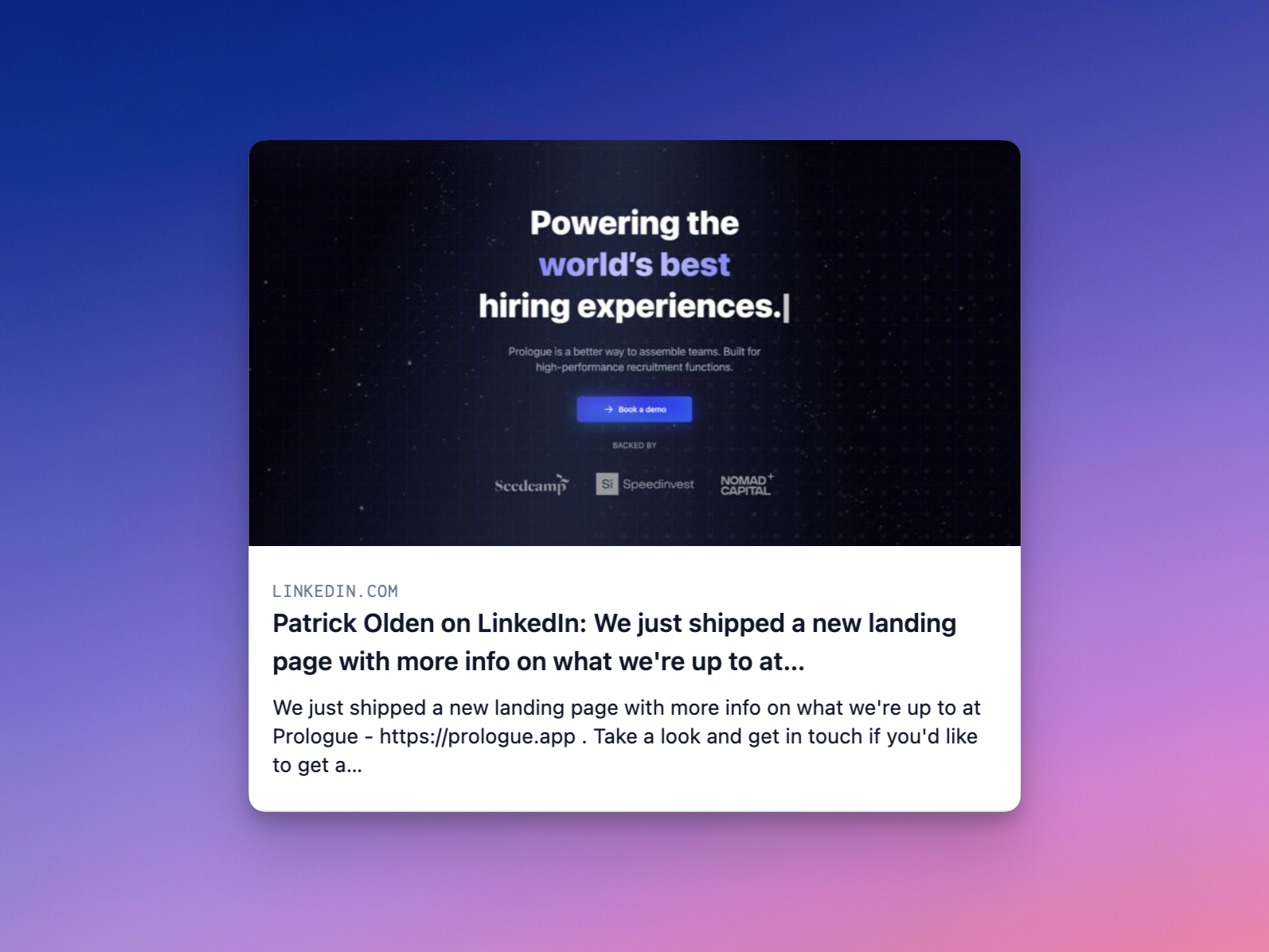
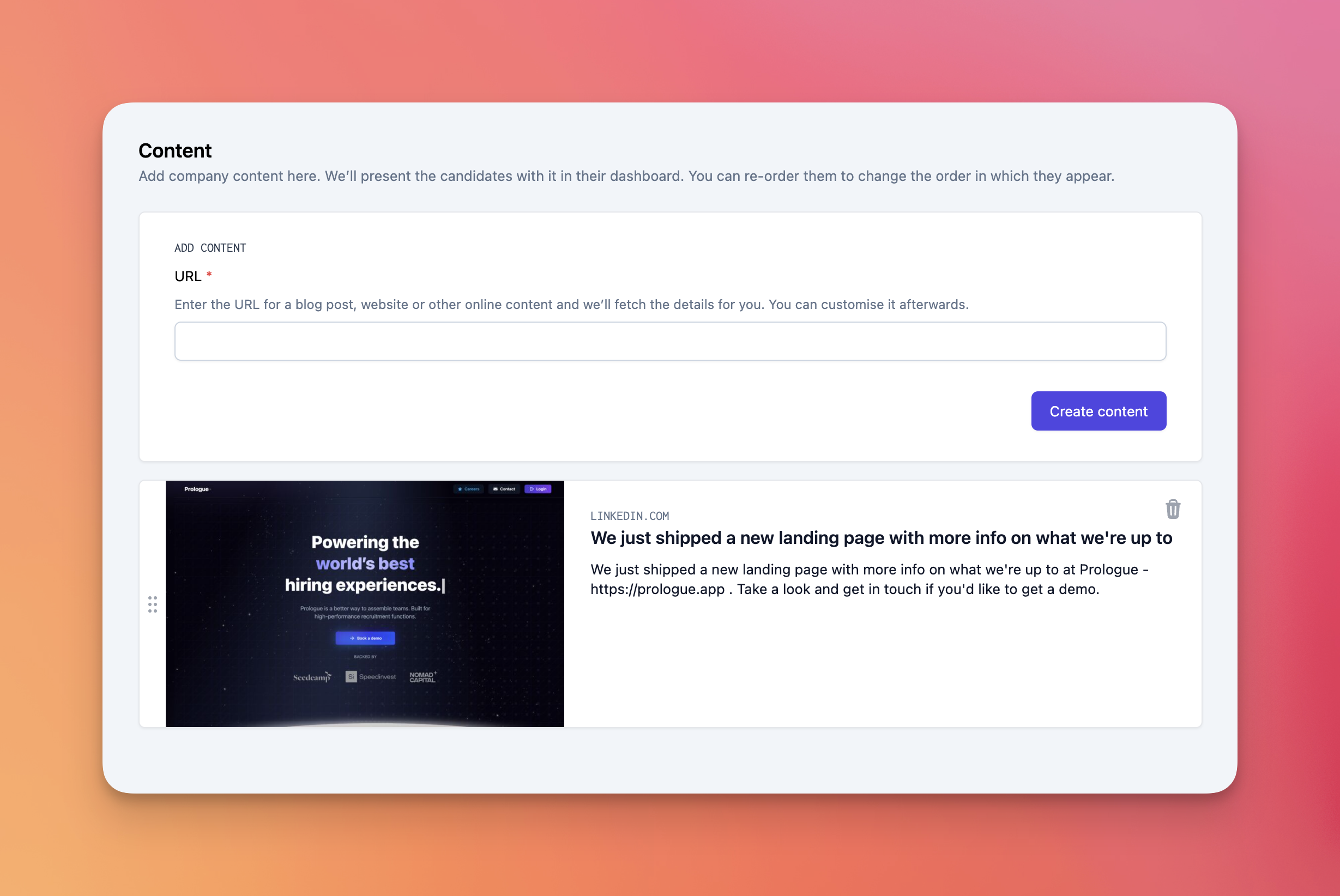
Introducing content cards, these give you a space to share updates from your company or give candidates an insight into what it's like working for you.
- You can author content cards in your settings pages. Add in a link and we'll automatically pull an image, the card title and description from the page. You can then fine tune this after.
- Content cards will show in all of your candidate dashboards. Any updates you make to these at the company level will immediately update for all candidates in your pipeline making it super easy for you to keep these relevant.
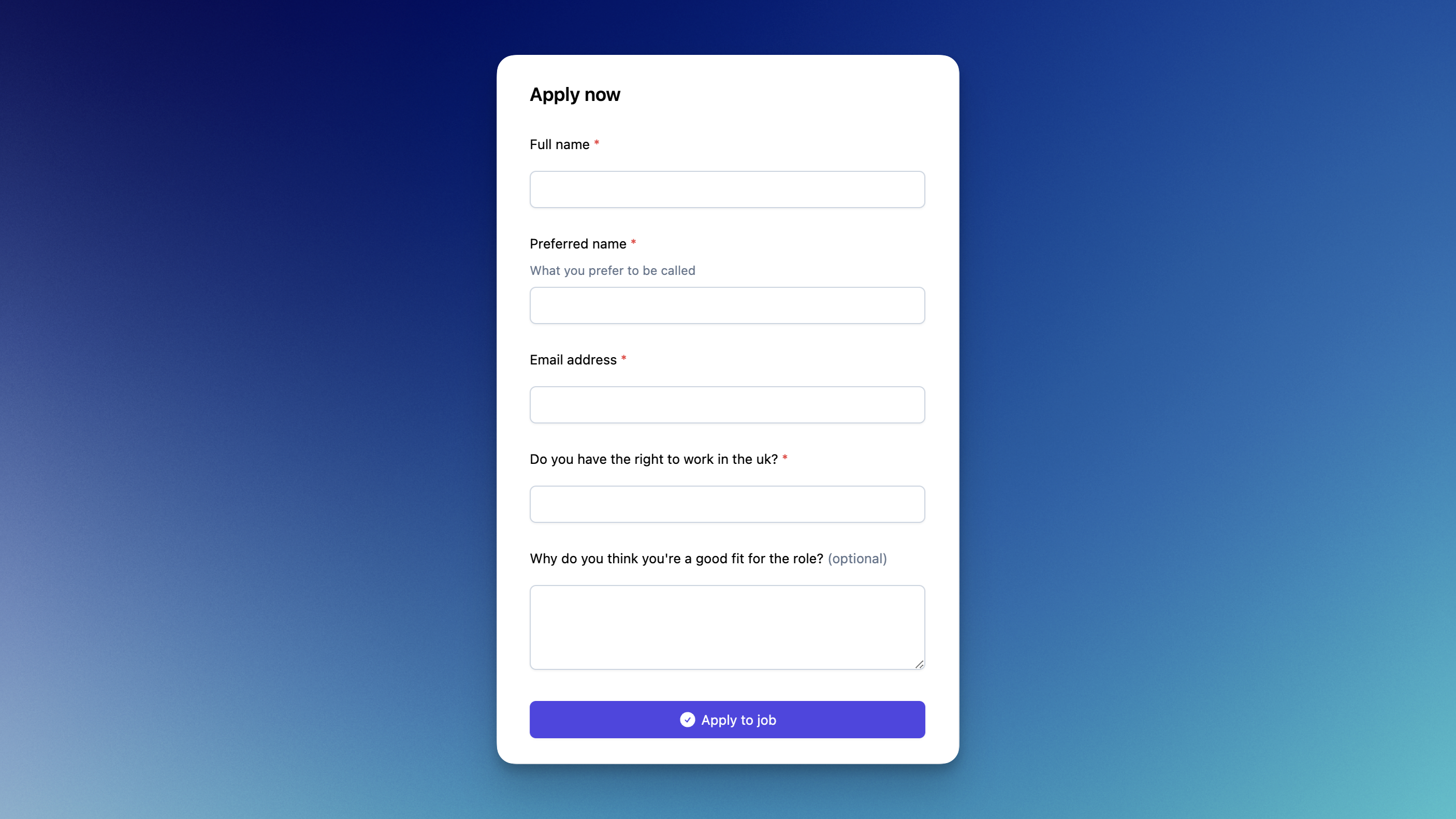
We've also brought some flexibility to our application questions functionality.
- Questions can now be marked as not required, meaning that candidates do not have to complete them in order to submit their application.
- Application questions created before this change will remain required.
- This doesn't impact any validation we perform if an answer is provided
Candidate dashboard
This week we have shipped several updates to the candidate dashboard. Candidate experience is at the heart of Prologue, and we're really excited about some of the changes we've made here in response to lots of incredible feedback from our private beta customers.
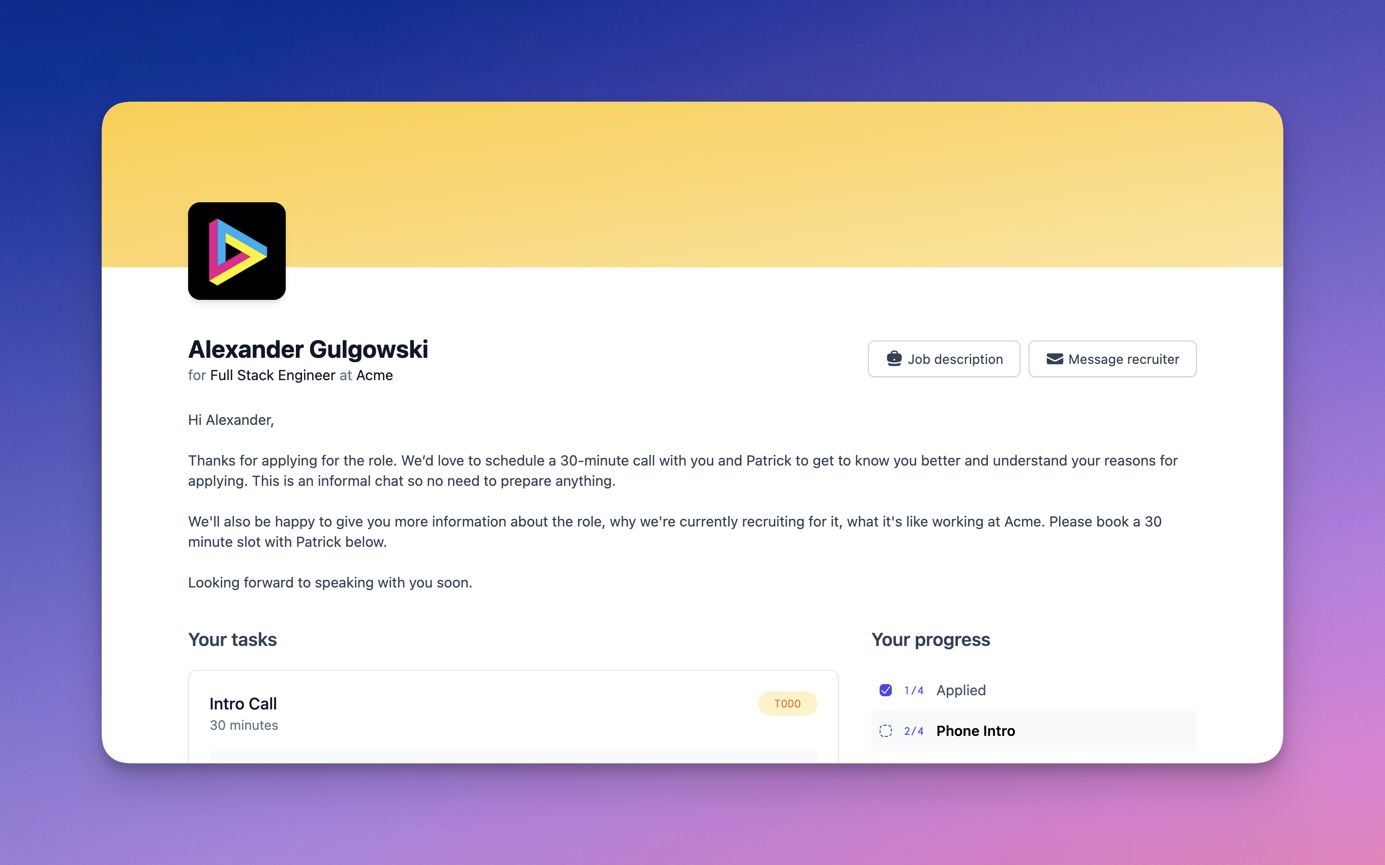
Aside from looking snazzier and performing better, the dashboard now features a number of improvements to help you better engage your candidates:
- More customisable (and better looking) branding — your page needs to feel like your page. We've adopted a more neutral palette for the page, and alongside your logo, you can now choose a header colour in your workspace settings.
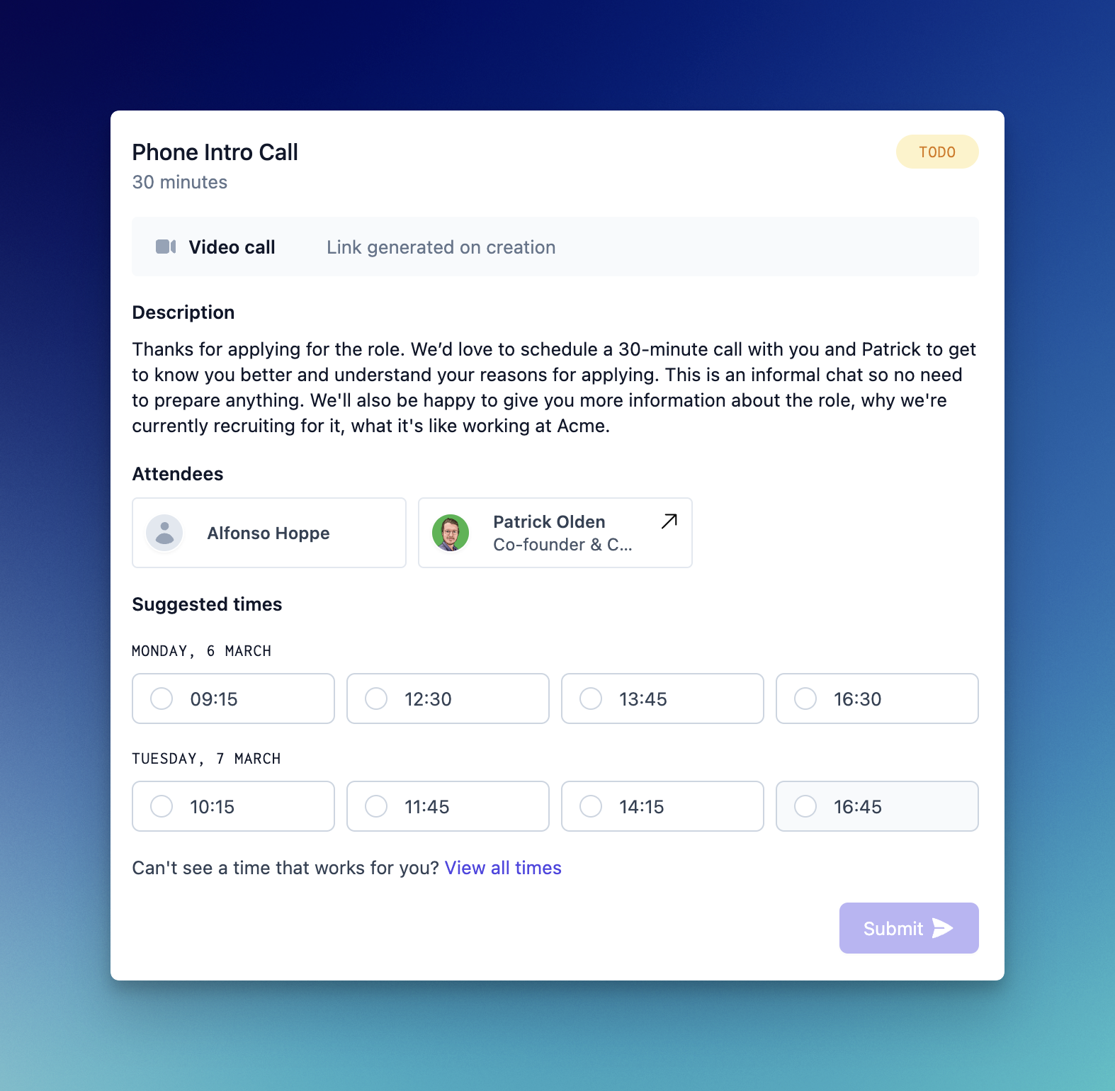
- Meeting card upgrades — these are now a one-stop-shop for information on what's coming up, featuring candidates as attendees, pictures of the interviewing team and single-click booking links. Check it out:
- Candidates can now message you directly from their dashboard with questions and feedback about the process. This is not quite a real-time chat with the recruiter, but we are exploring this and other options as we speak!
Disqualified stages
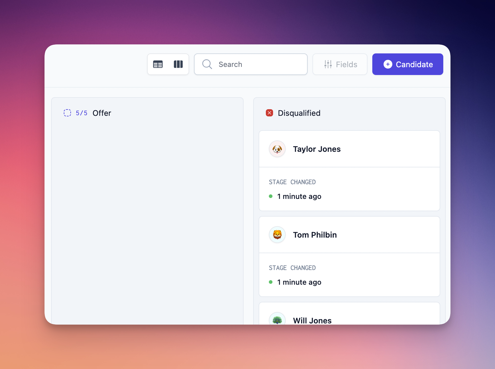
“Disqualified” is now a stage, just like “Sourced” or “Applied”. As a result you don't need to filter to view or hide disqualified candidates — they are all accessible in the disqualified stage tab (in the table view of the pipeline) or the disqualified column (in the Kanban view).
Personalised candidate guides
You can now personalise candidate guides on a per-candidate, per-stage-transition basis. Guides will default to those you have defined in the job's stages, and use the same variables:
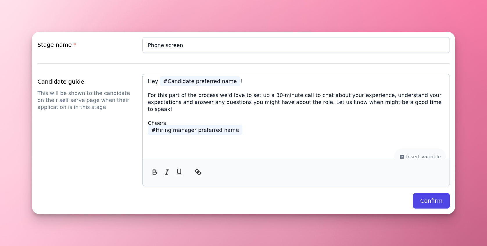
When you move a candidate to a stage, the stage's guide will be loaded (with its variables expanded) and can be customised as necessary. Optionally, you can now also control whether or not a candidate receives an email notification informing them that their application has been updated.
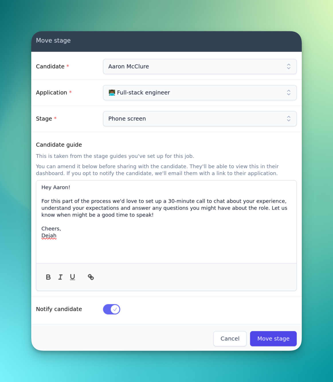
Now that “Disqualified” is a stage, you can also customise guides for disqualified candidates, and choose whether or not to notify them upon disqualification.
External recruiter/agency feedback
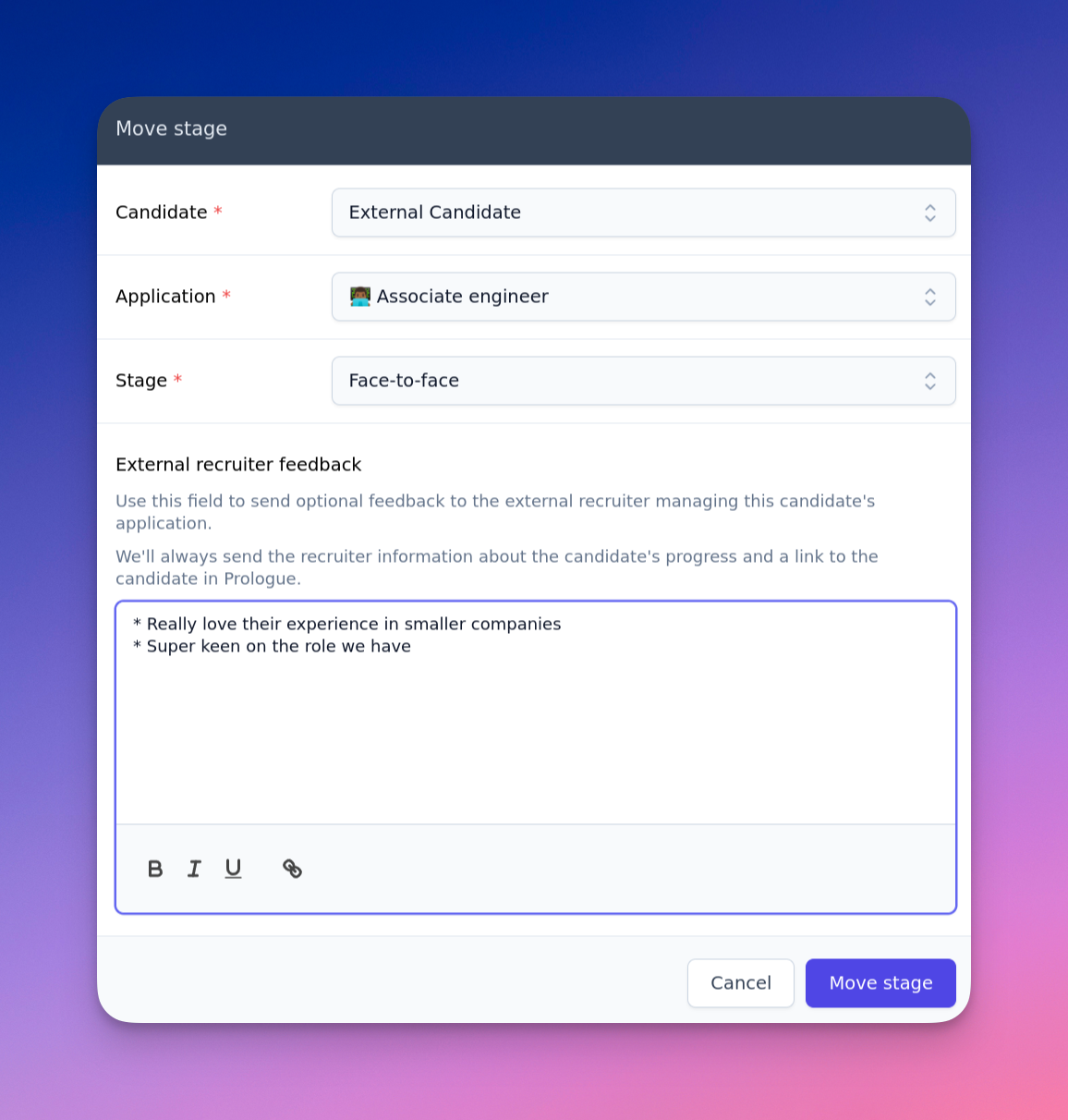
The new move stage dialog also allows you to provide detailed feedback to external recruiters or agency colleagues about why a candidate is or is not progressing.
Drag and drop Kanban boards
The Kanban board view of the pipeline now supports drag and drop! Dropping a candidate will once again load up the move stage dialog, allowing you to customise a guide for the candidate and whether or not they will be notified.
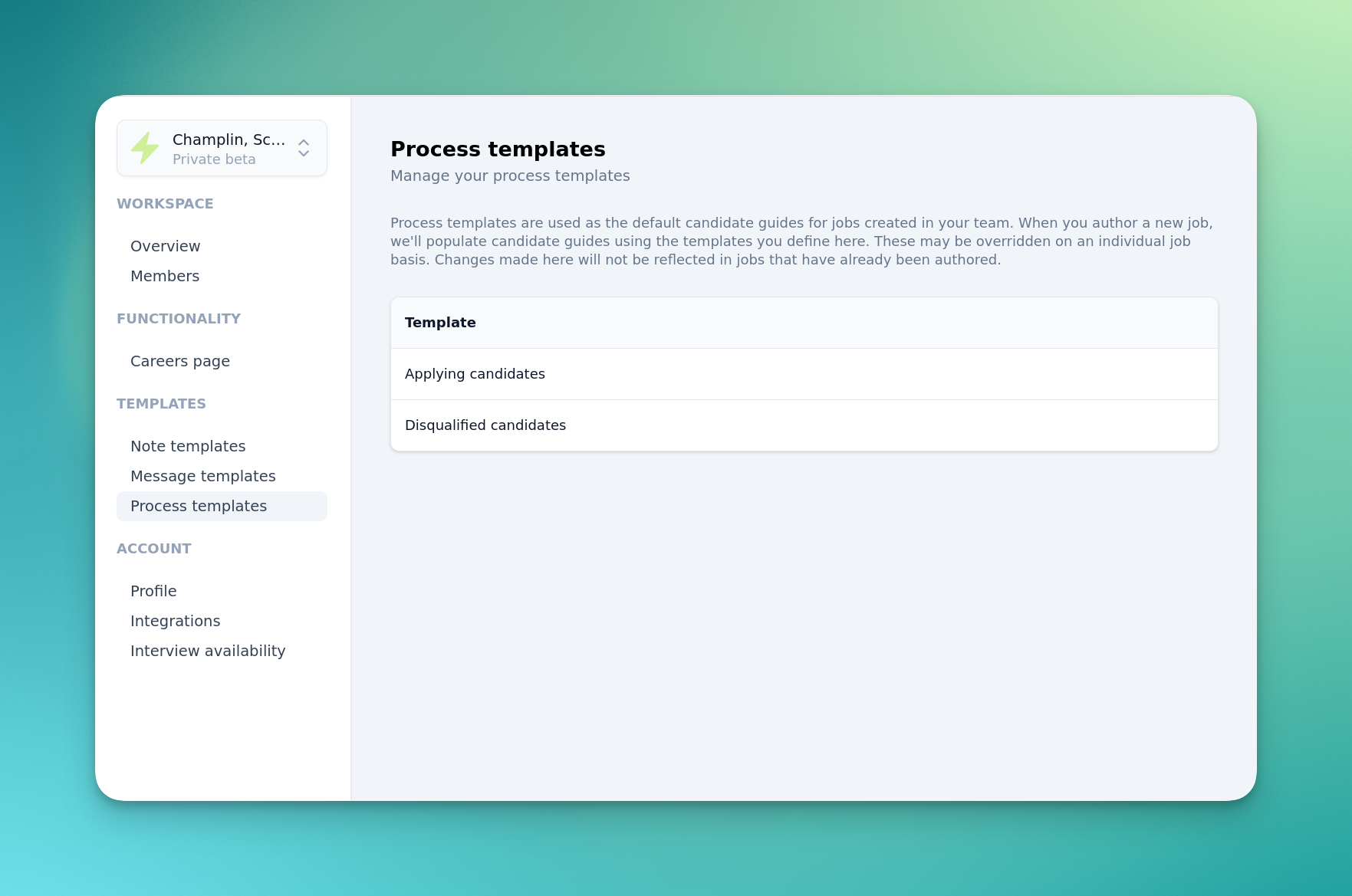
Process templates
For common tasks like welcoming newly-applied candidates, or warmly disqualified unsuccessful applicants, it can be useful to have a set of templates that can be reused. We've added the “Process templates” page to the settings for just this purpose. From here you can configure default candidate guides that will be used for all new jobs. At present we support the “Applied” and “Disqualified” job stage types:
