June 16th, 2023
Job authoring redux
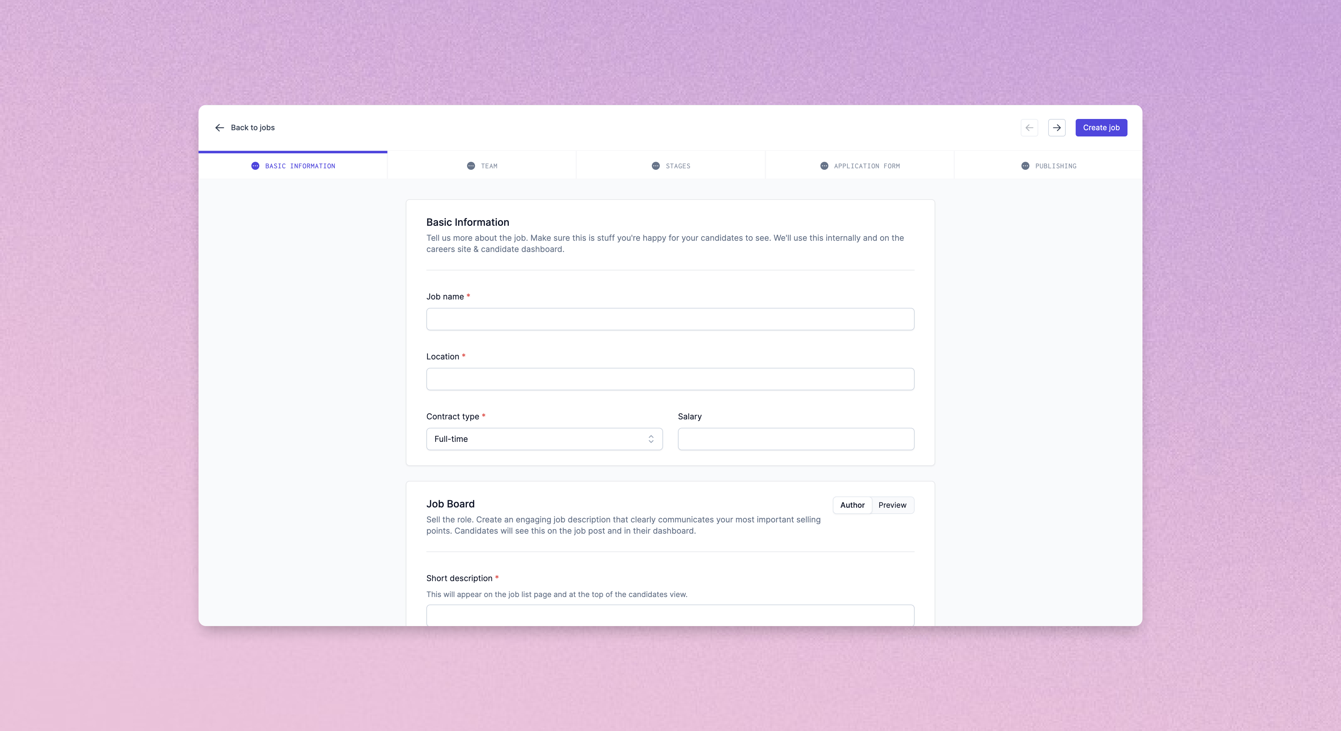
Job authoring is at the heart of the recruitment process, and we're excited to share the next iteration of it in Prologue. Job creation and updates are now split over multiple tabs, making it easier to focus on the task at hand, or to spot errors or missing fields across a job's data set.

Dividing up the process in this way allows us to provide more real estate to important activities, such as previewing job descriptions or configuring application questions. In the near future we'll also be taking advantage of the new layout to surface information relevant to the edits you're currently making – the required reading age and gender codings of your job descriptions, or total length of your interview process, for instance.

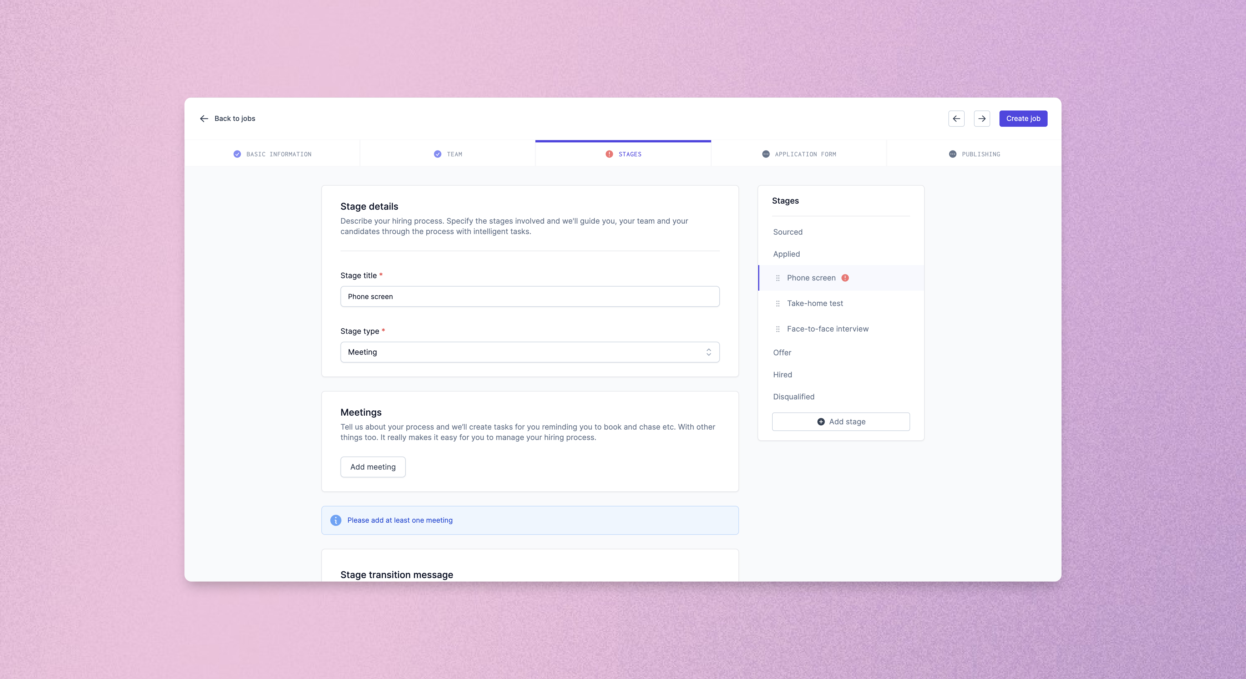
Job stages have also been given a new lease of life, with a slicker interface for adding, removing and reordering stages as well as more break-out space for configuring meetings and candidate messaging.

We really hope you enjoy Prologue's new authoring experience. Let us know what you think!
Improved (improved) navigation
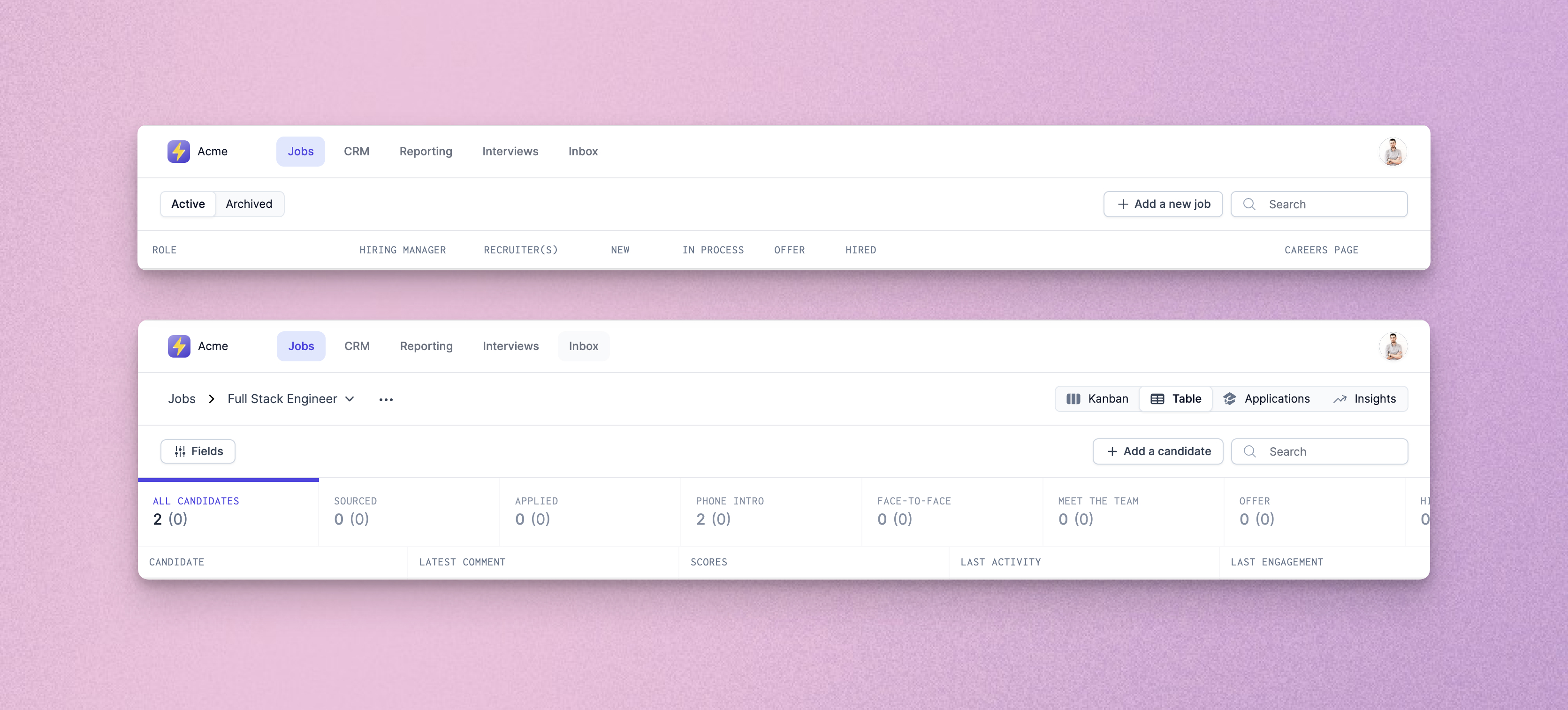
After feedback we received on last week's navigation improvements, we've rejigged the top navigation bar to do away with the sidebar entirely, and give you a single, always accessible place to move around your Prologue instance.

Improvements and fixes
- We've fixed issues with outdated messages flickering in the progression dialog when moving candidates between stages.
- PDF CVs are now embedded into the “Profile” tab of the application review details screen, allowing quicker review of candidate profiles.
- Application review details pages will now automatically move to the next candidate in the list when you make a decision to disqualify or progress.
- Application review checkboxes have been padded out so that they are easier to click. A new “Select all” option is also available for quick selection of all candidates (check out the keyboard shortcuts too – Ctrl/Cmd+A to select all, Escape to clear, and Shift+Click to select groups!).
