June 23rd, 2023
Improvements to the pipeline and Kanban board
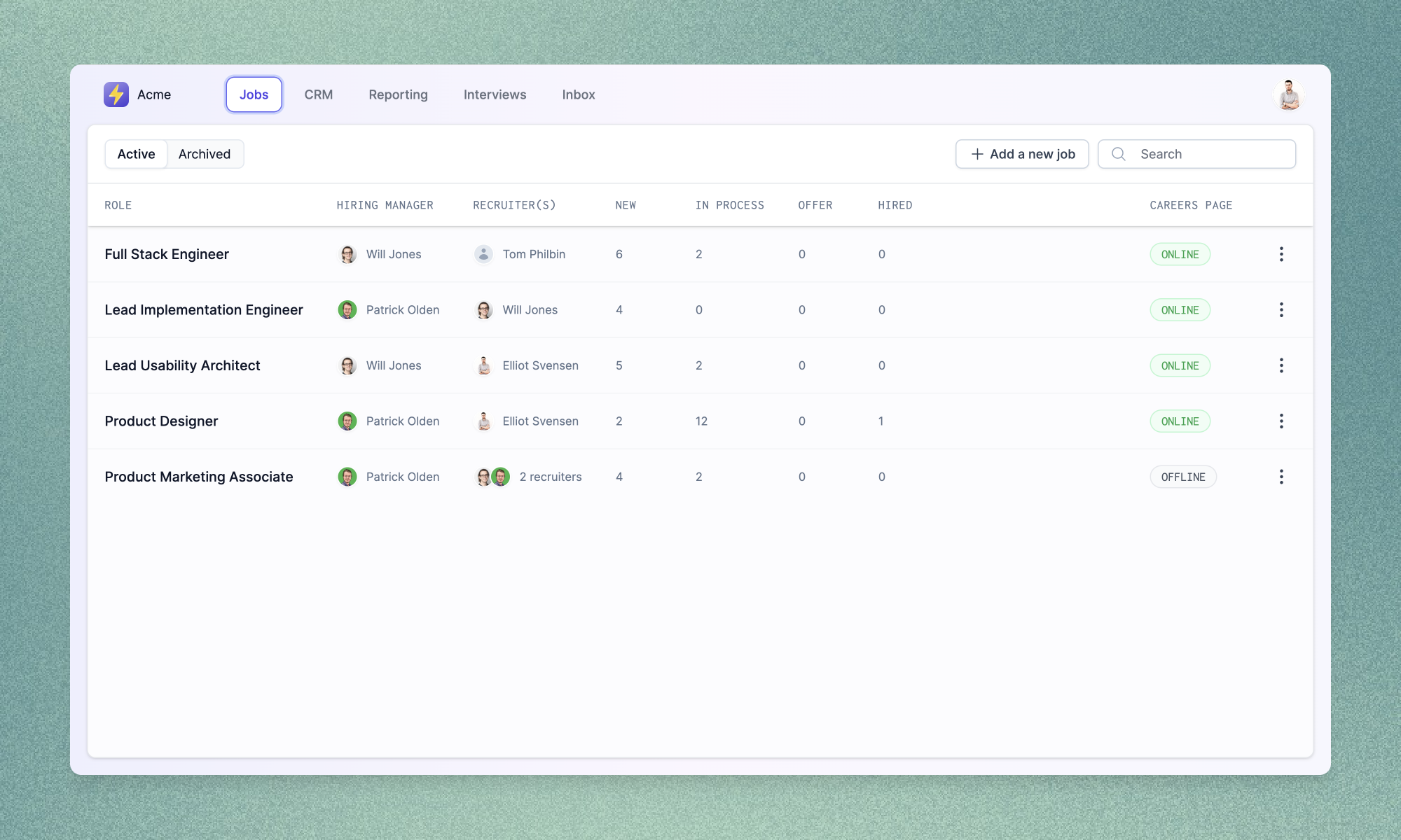
This week we've been hard at work improving the visual hierarchy and consistency of Prologue in preparation for a number of exciting changes coming in the following weeks (stay tuned for those!). First up, we've pulled out our new and improved navigation bar so that you can always tell which elements will stay put when you navigate and which will change with the page you're on.

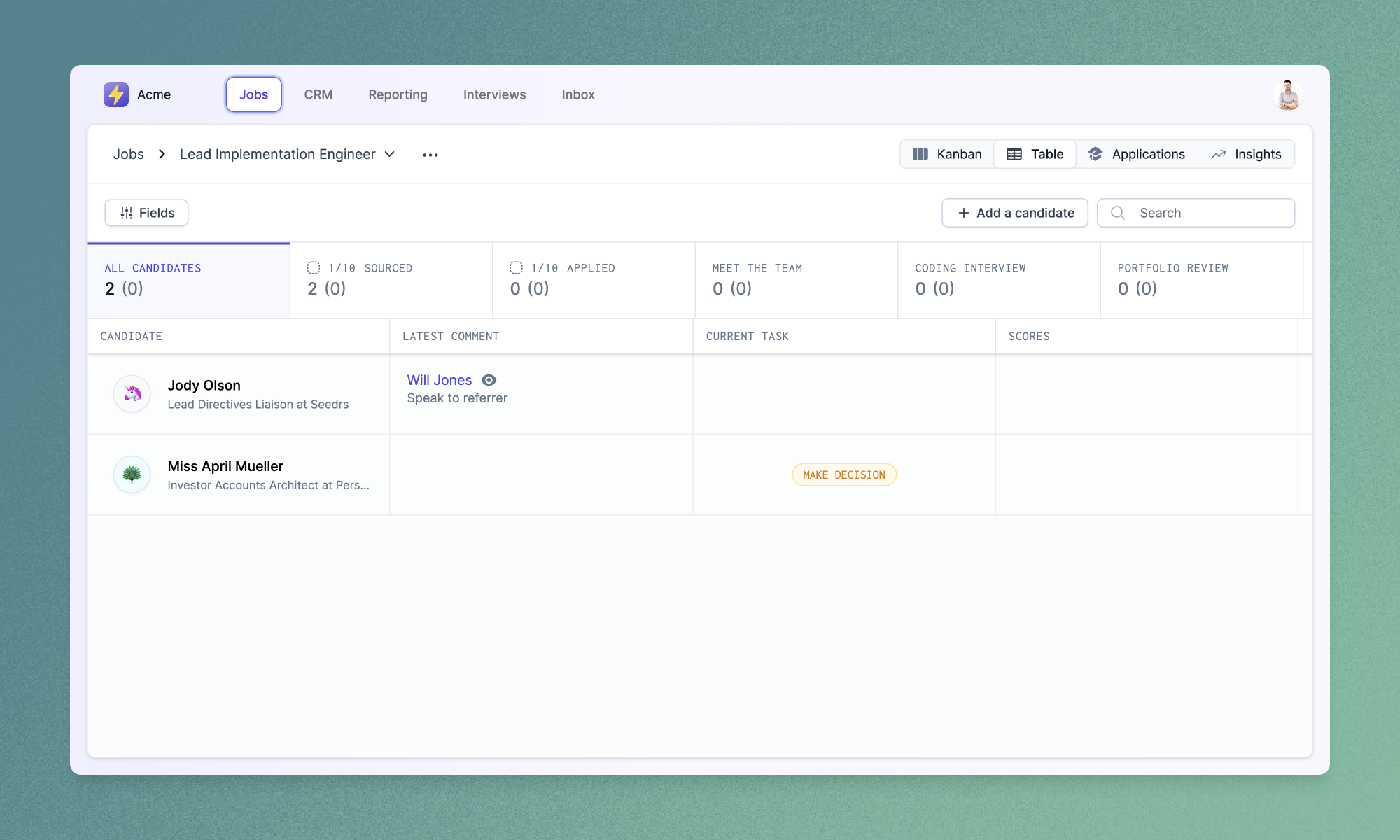
The pipeline and Kanban board views have been given a fresh lick of paint to fit into this new structure. The pipeline view now shows current candidate tasks (bringing it more in line with the existing Kanban tickets), while the Kanban board displays more granular counts (including information about new candidates) and better breakdowns of applications needing review.

Improvements and fixes
- We've added richer editor controls for authoring job descriptions and other fields which use Markdown. You can now emphasise text, add headings or create links using newly added toolbar buttons.
- You can now customise the set and order of team member biographies that will appear on your careers page using the new “Meet the team” section in the “Careers page” settings page.
