February 27th, 2023
Candidate dashboard
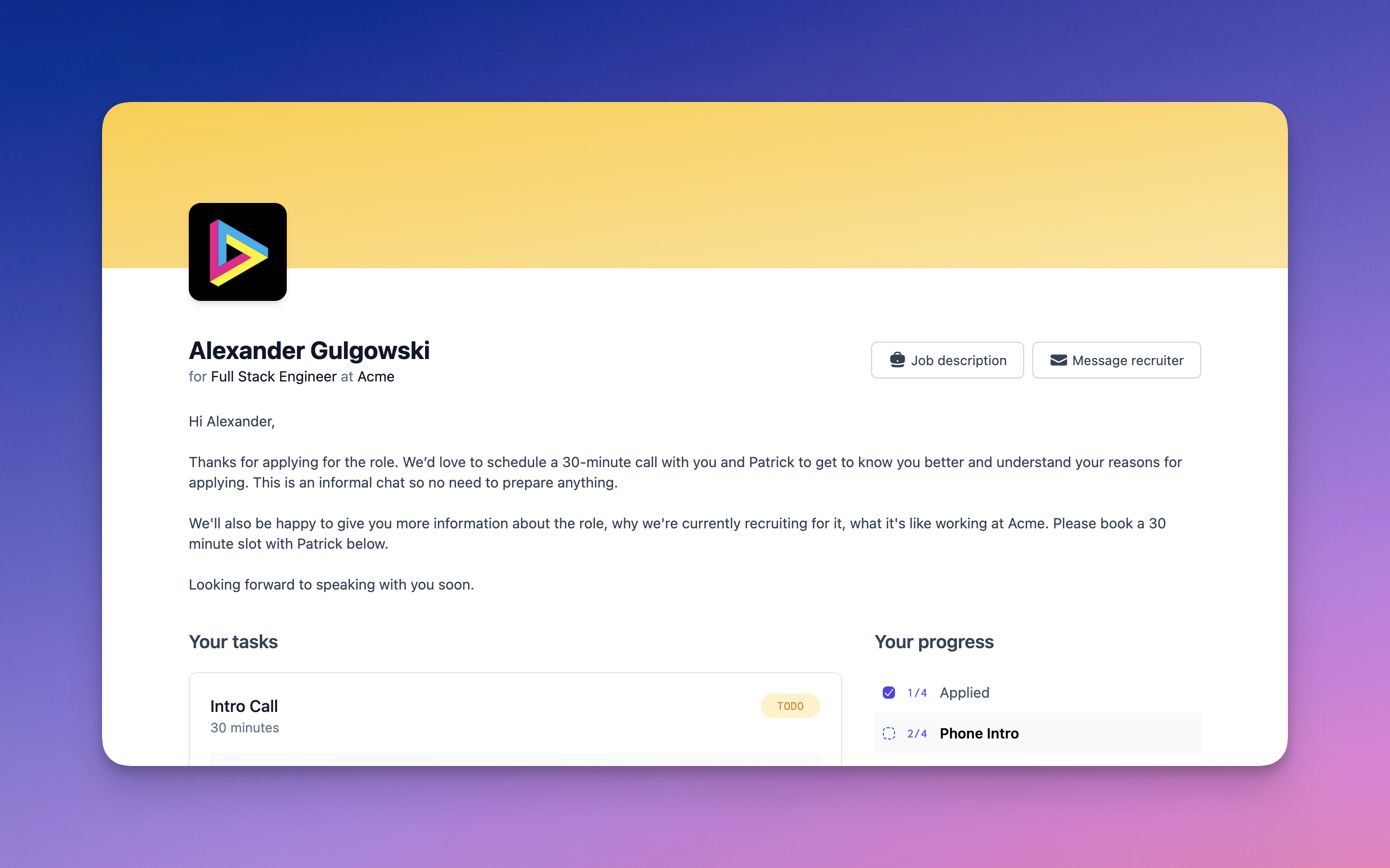
This week we have shipped several updates to the candidate dashboard. Candidate experience is at the heart of Prologue, and we're really excited about some of the changes we've made here in response to lots of incredible feedback from our private beta customers.

Aside from looking snazzier and performing better, the dashboard now features a number of improvements to help you better engage your candidates:
- More customisable (and better looking) branding — your page needs to feel like your page. We've adopted a more neutral palette for the page, and alongside your logo, you can now choose a header colour in your workspace settings.
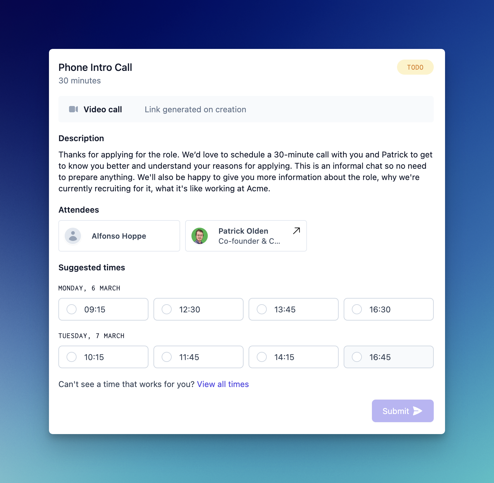
- Meeting card upgrades — these are now a one-stop-shop for information on what's coming up, featuring candidates as attendees, pictures of the interviewing team and single-click booking links. Check it out:

- Candidates can now message you directly from their dashboard with questions and feedback about the process. This is not quite a real-time chat with the recruiter, but we are exploring this and other options as we speak!
